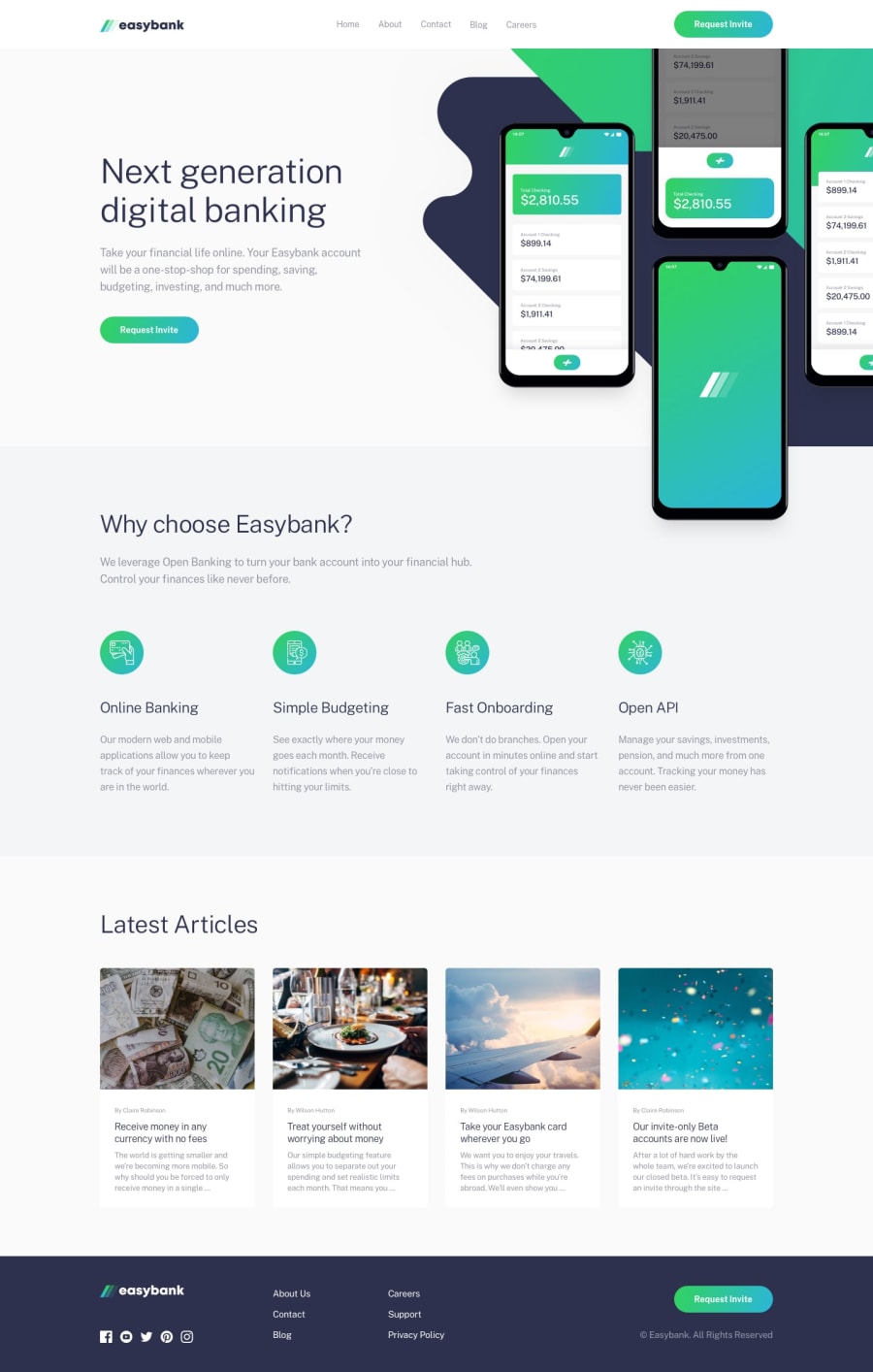
Design comparison
SolutionDesign
Solution retrospective
any feedback would be much appreciated
Community feedback
- @michey85Posted almost 4 years ago
Hi there! Nice looking hover effect on menu items. Cool!
What is better to improve:
- size of all heading and paddings inside all section
- first Request invite button need hover effect and also cursor poiner
- top image should be over next section too: you could try with positioning (relative or absolute) or negative margin-top for the next section
- for articles is better to fix images - it should be all same size
- on mobile I see horizontal scroll - try to fix it, plus some text is under the top image
- try bem notation for css class naming
2@InKABuserPosted almost 4 years ago@michey85 thank you so much for your feedback, 1 thing I'm confused about is that i don't see a horizontal scroll
0 - @AnNguyen1510Posted almost 4 years ago
hey, how can i have the psd file
1
Please log in to post a comment
Log in with GitHubJoin our Discord community
Join thousands of Frontend Mentor community members taking the challenges, sharing resources, helping each other, and chatting about all things front-end!
Join our Discord
