Design comparison
Community feedback
- @iprinceroyyPosted over 2 years ago
Hey @elahemirzaee, you did excellent work. Congrats!
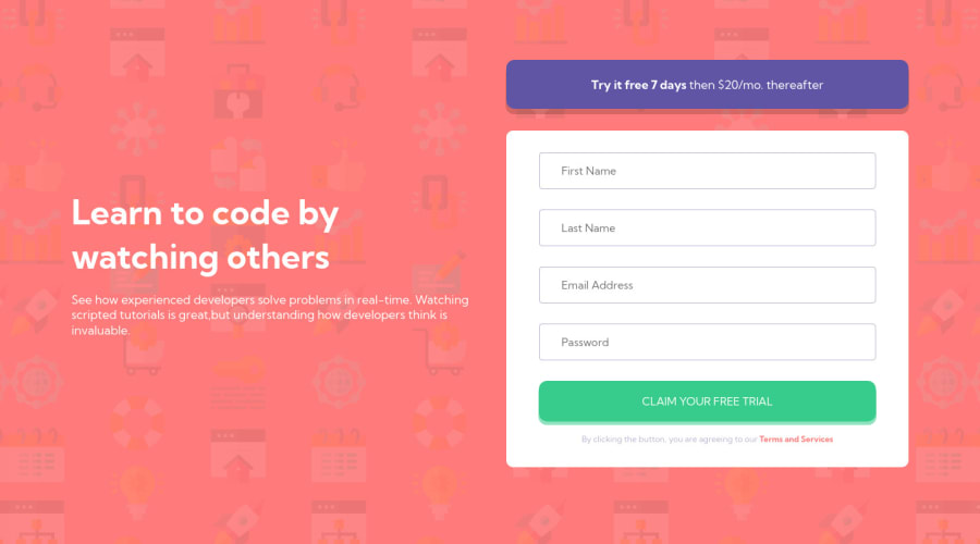
You can prefer clamp property for h1 to make a responsive font for different devices & to match the design. You forgot to add the shadow property to the form element.
Instead of using the main class, you can use the main tag to avoid accessibility issues.
Hope it adds to your learning. Happy coding :)
Marked as helpful0@elahemirzaeePosted over 2 years ago@iprinceroyy Thanks Prince Roy for your good advices🙂👍🏽 I have made the changes in my code, can you check it again? (if it is possible🌸)
0@iprinceroyyPosted over 2 years ago@elahemirzaee now it looks perfect. 👍
Try to focus on the accessibility issues stated & avoid that issues. Great, that's all for now. Congrats on completing this challenge!
0
Please log in to post a comment
Log in with GitHubJoin our Discord community
Join thousands of Frontend Mentor community members taking the challenges, sharing resources, helping each other, and chatting about all things front-end!
Join our Discord
