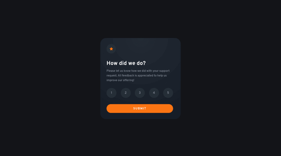
Mobile first Interactive rating component
Design comparison
Community feedback
- @mattstuddertPosted over 2 years ago
Brilliant work on this challenge, Nakoya! Your HTML looks great, and you've done an excellent job getting the solution close to the design. My only small suggestion would be to add focus states so that the
labelhas an outline when the correspondinginputis focused. You can do that with the sibling CSS selector like thisinput:focus + label. The visual state changes if you use the arrow keys when on the radio inputs, but you'll notice if you tab through the page, there's no initial style to provide a visual cue.I hope that helps. Keep up the incredible work! 👍
Marked as helpful0@nakoyawilsonPosted over 2 years ago@mattstuddert Thanks for the suggestion Matt! And thank you for the encouragement. I'll work on adding focus states.
1
Please log in to post a comment
Log in with GitHubJoin our Discord community
Join thousands of Frontend Mentor community members taking the challenges, sharing resources, helping each other, and chatting about all things front-end!
Join our Discord
