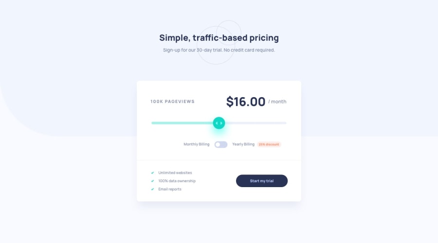
Mobile first Interactive Pricing Component
Design comparison
Solution retrospective
This challenge actually took me more time than I expected but I'm happy with the way it looks now. The most challenging part for me was updating the yearly price.
But as usual, your feedback and any suggestions on how I can improve are welcome
Community feedback
- @ApplePieGiraffePosted over 3 years ago
Hi, Jhoell Opeyemi! 👋
Nice job on this challenge! 👏 Your solution looks good, is responsive, and works very nicely! 👍
The only one or two very minor things I suggest are adding a focused state to the toggle-switch and making sure the grey background shape extends all the way to the right side of the screen in the desktop layout of extra-large screens (currently, it stops short). 😉
Keep coding (and happy coding, too)! 😁
0@JhoellOpeyemiPosted over 3 years ago@ApplePieGiraffe Thanks for your feedback.. I'll include your suggestions when next I make edits
0
Please log in to post a comment
Log in with GitHubJoin our Discord community
Join thousands of Frontend Mentor community members taking the challenges, sharing resources, helping each other, and chatting about all things front-end!
Join our Discord
