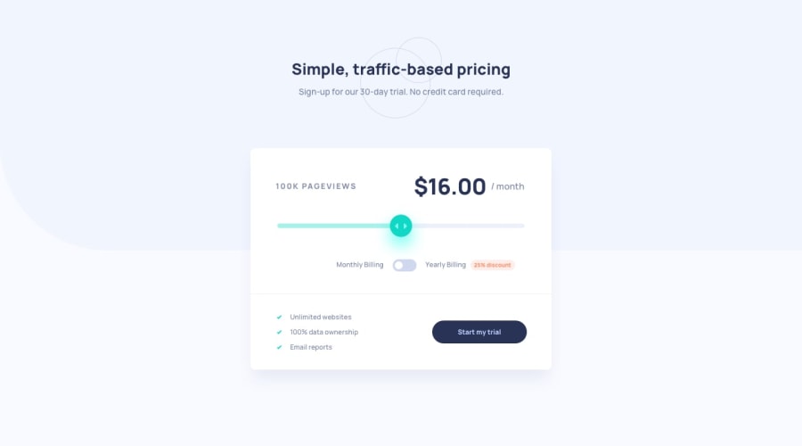
Mobile First - Interactive Pricing Component
Design comparison
Community feedback
- @Moyo75Posted over 3 years ago
On mobile:
-
You might want to reduce the margin values on
<div class="container"></div>to make the component look more like the design. -
The toggle button seems shrunked, making the toggler appear out of place. Also the elements and texts flanking the buttons should on one line. I think this goes back to the padding on
<div class="container"></div>. You might want to reduce it to create more room for the elements.
General:
-
You're missing the light blue background on the bottom part of the design. I think the color code for this is provided in the style guides.
-
Your slider is missing its two complementary colors, the arrows on the slider thumb and it doesn't do anything on change. I believe the color codes and necessary assets are in the starter files; on changing the slider, the pageviews count should increase and also the amount as described in the readme file.
-
The toggle button is missing its background color state changes. The amount should be discounted by 75% when the button is clicked. Multiplying the amount by 0.75 gets the job done.
I hope this helps make your app function and look as described in the style guides and requirements of this project.
1 -
Please log in to post a comment
Log in with GitHubJoin our Discord community
Join thousands of Frontend Mentor community members taking the challenges, sharing resources, helping each other, and chatting about all things front-end!
Join our Discord
