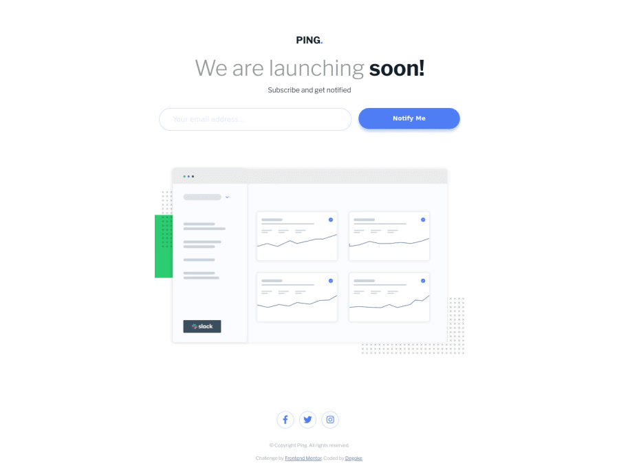
Design comparison
Solution retrospective
Think i'm getting better at this
Community feedback
- @ApplePieGiraffePosted about 4 years ago
Good job, again, Degoke! 🙌
Like artimys said, keep it up! 👍
😁
1 - @artimysPosted about 4 years ago
Looking good Degoke 👍👍 I think it's time for an advance challenge lol
Some feedback:
-
The
labeltags probably don't need theforattributes since theinputis inside thelabel -
Might not matter actually but I'll throw it out there. When the error message appears it shifts the elements below a bit. Find a way to display the error message and have it not shift. Fixed height or
invisibility: hiddeninstead ofdisplay: none. invisibility hidden hides it on the page but it still takes up the space as if it weren't hidden -
Create a class that when applied to your form through JS, it activates the
display: blockandborder-color
Keep on going, you're doing great!!!
1 -
Please log in to post a comment
Log in with GitHubJoin our Discord community
Join thousands of Frontend Mentor community members taking the challenges, sharing resources, helping each other, and chatting about all things front-end!
Join our Discord
