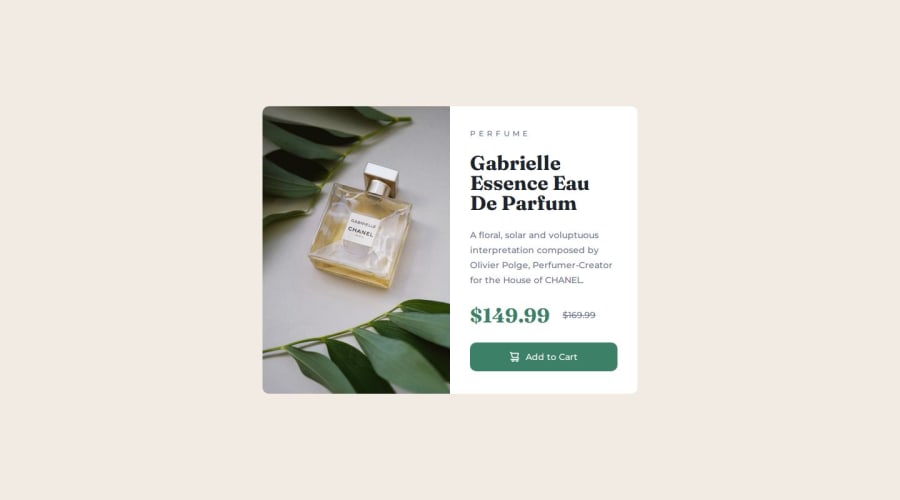


Design comparison

Solution retrospective
I really get an appreciation of how difficult it can be to get the correct spacing, colors etc without the design file.
What specific areas of your project would you like help with?I always appreciate any form of feedback.
Community feedback
- P@elisilkPosted 8 months ago
Hi 👋 @danmlarsen,
Great solution. It matches the design very well, despite not having access to the design file. 👏
Even without the design file, one method that helps is to install a plugin like PixelParallel or PerfectPixel so you can overlay the design screenshots on to your solution and compare them directly to each other 🔎, and then make adjustments as needed.
For example, in the desktop view, you have the
product-cardcurrently set with amin-height: 46rem;(equivalent to460pxin the root font size you set). But using the PixelParallel extension alongside the Chrome inspection tools, I was able to just thatmin-heightvalue up and down and watch it change until it matched the design. The design height is probably more like450px(equivalent to45remin your system) and so your design is a little bit too tall. Something to consider 🤔.Happy coding. 💻
Eli
Marked as helpful1 - P@dedo-devPosted 8 months ago
Hey Dan, you are doing a great job of solving this challenge, your code is clear and easy to read.
I have just one suggestion, as you can see in the challenge folder we have two images, one for mobile and one for desktop, instead of using the image as a header background, check out this article to understand how to render images properly based on the device by using
<picture>, with that the images are fully accessible and the browser upload just the right images with the right device.Don't forget to add the
alttext if you decide to use this approach.Cheers✌️
📖Keep Learning 💻Keep codingMarked as helpful1


Please log in to post a comment
Log in with GitHub
Join our Discord community
Join thousands of Frontend Mentor community members taking the challenges, sharing resources, helping each other, and chatting about all things front-end!
Join our Discord