Design comparison
Solution retrospective
Third proyect in 3 days! Lets continue coding.
This one seemed easy at first, but I spent some time with tiny details. My aproach:
- first mobile version, using advantage of divs as block tag.
- Use flexbox to move cards around and set sizes in desktop version.
I always have the feeling that my CSS code is very messy, if someone can help me advaice would be great!
Problems that take me sometime to solve:
-
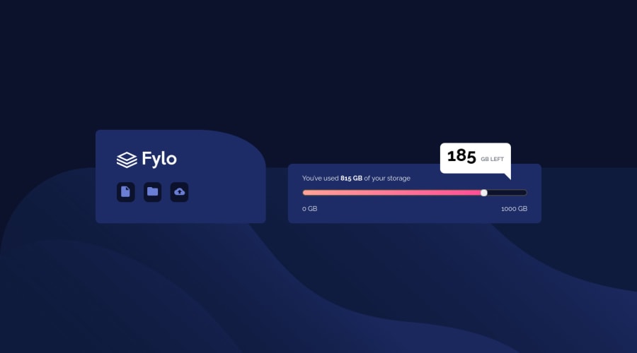
Background for logos(document, folder..). I put those img tags into a div a give that div the color needed. Happy to know if there is an easier way.
-
I spent some time doing the speech bubble in the desktop version. I used pseudoelement ::after to create a div a move it around.
-
Change range input style by default: I didn't imagine that was so complicated haha. I did with a linear gradient. Need JS to change when user move the input. I'll look into it in the future.
All feedback is welcome!! Thanks!
Community feedback
Please log in to post a comment
Log in with GitHubJoin our Discord community
Join thousands of Frontend Mentor community members taking the challenges, sharing resources, helping each other, and chatting about all things front-end!
Join our Discord
