Design comparison
Solution retrospective
Hello everyone, I want you to feedback. Thanks for your time
Community feedback
- @TheqwertypusherPosted over 3 years ago
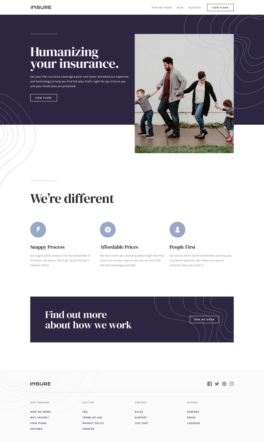
Curious, why did you choose grid for the 'top-section'? Because the header, p, and button are put into its own grid box you get unnecessarily large spaces
I'd recommend using flex-box for this section and then putting the image into a div as opposed to a section tag. Remember section tags denotes a group of content so the img being in its own section is unnecessary as it relates to the left content.
The img width should be adjusted to match design, you can use position absolute to put it exactly where you want relative to its parent container (make sure to make the container position relative)
With a smaller screen adjust the paragraph widths so you don't end up with a really long single line and then 1 or 2 words on the next line
When the screen is <768px, the footer is unnecessarily long because it's a single column. Use grid or flex-box to break it up
0 - @palgrammingPosted over 3 years ago
you need to work on the background of your buttons so the background images are not showing up in them
0
Please log in to post a comment
Log in with GitHubJoin our Discord community
Join thousands of Frontend Mentor community members taking the challenges, sharing resources, helping each other, and chatting about all things front-end!
Join our Discord
