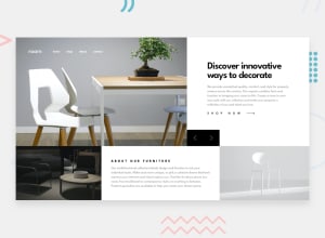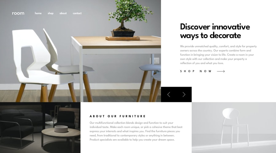
Design comparison
SolutionDesign
Solution retrospective
played around with animations, tell me what you think?
Community feedback
- @palgrammingPosted over 3 years ago
well I think having the text change and the photo change is really distracting for the user cause one does not really know where to look with ones eye
maybe if the text faded out in opacity that might help some how the animation between the photo and text would need to somehow work together with the timing of each other
also the nav links at top might need some hover change
1
Please log in to post a comment
Log in with GitHubJoin our Discord community
Join thousands of Frontend Mentor community members taking the challenges, sharing resources, helping each other, and chatting about all things front-end!
Join our Discord
