Submitted over 3 years ago
Mobile first, Grid, Flexbox and a little javascript
@drajnish
Design comparison
SolutionDesign
Solution retrospective
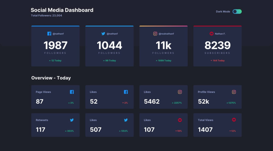
Suggestions regarding border top of instagram card or any other where i can improve would be appreciated.
Thanks.
Community feedback
- @palgrammingPosted over 3 years ago
You have the Mobile header layout being used even in the Desktop view but otherwise a good start to this challenge
0@drajnishPosted over 3 years ago@palgramming changes done.
Thank you for reminding me to change desktop header layout. I totally forgot that part.
Thanks once again.
0
Please log in to post a comment
Log in with GitHubJoin our Discord community
Join thousands of Frontend Mentor community members taking the challenges, sharing resources, helping each other, and chatting about all things front-end!
Join our Discord
