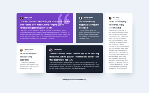
Submitted over 1 year agoA solution to the Testimonials grid section challenge
Mobile First | Grid | Flexbox
@NiloyDas07

Solution retrospective
What are you most proud of, and what would you do differently next time?
I got comfortable with grid and will be able to use it much easier in the future.
What challenges did you encounter, and how did you overcome them?It was simple.
What specific areas of your project would you like help with?Can someone please check if I used the BEM methodology properly for my class names?
Code
Loading...
Please log in to post a comment
Log in with GitHubCommunity feedback
No feedback yet. Be the first to give feedback on Niloy Das's solution.
Join our Discord community
Join thousands of Frontend Mentor community members taking the challenges, sharing resources, helping each other, and chatting about all things front-end!
Join our Discord