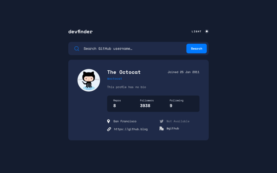
Design comparison
Solution retrospective
Please feel free to leave any feedback or suggestions on how I can improve the site.
Community feedback
- @pikapikamartPosted about 3 years ago
Hey, but first, I love that animation, really really great! What did you use on it? Did you manually create the animation?
Layout in general looks really good.
Some suggestions would be:
- For this one, you could use the preferred structure:
<header />
<main />
This way, elements are in their respective landmarks.
- You don't need to use
navin here, since there are no navigation links that are included. - Since you are using next.js, the initial data should be persisted on the page, you can use
getStaticPropsto fetch the data from theapiso that your data will be pre-rendered and outputs it along with thehtml. I am still new to next.js so I can't give exactly the best approach. - The color theme should be using
input type="radio"for those and not justdiv.divalone is not accessible. The structure of the color theme would look like:
<fieldset>
  <legend className="sr-only"> { describe the use of the radio buttons } </legend>
</fieldset>
Take a look at my rest-api-colortheme toggler inspect the color theme and see the structuring. This makes your color theme reliable and accessible.
inputneeds to have alabelelement or anaria-labeldescribing what theinputdoes.- You could add an
aria-liveelement on this one, the element will state if there is user that has been found or if the user is not found, something like that, so that you provide more accessibility and information about the user. - The
altfor the user'simgshould be their name. Also, when usingaltattribute, avoid using words that relates to "graphic" such as "profile, picture, image.." it is already an image, no need to describe it as one. - The date when the user have joined shouldn't be a heading tag.
- The 3 information below could have used
ulsince those are "list" of information or better , usedlelement on it, each title like thereposfollowerswould bedt. - I forgot up top, avoid using
height: 100vh. Try inspecting your layout in dev tools at the bottom, scroll down, the layout is not totally occupying all. Instead, usemin-height: 100vh. - For the 4 information again below, you can use
dlon it, and make thedtelement bescreen-readeronly text, describe on what is the data all about. For example,
<dt className="sr-only"> location <dt>Then just other for "twitter account" "website" and so on.
- The icons should have used
aria-hidden="true"on it as well.
Other than those, really great job on this. Still, that animation was sick.
0@asim-ali5514Posted about 3 years ago@pikamart Thanks for the really great and specific feedback, as for your question with the animations, I used a React library called framer motion which makes it really easy to implement animation like the ones you see on the page. I would definetly recomend checking it out. But seriously, thanks for all of these different ways I can make my code better, I'll make sure to implement them in this project and many more to come.
0@pikapikamartPosted about 3 years ago@asim-ali5514 Awesome, thanks as well for the answer!
0
Please log in to post a comment
Log in with GitHubJoin our Discord community
Join thousands of Frontend Mentor community members taking the challenges, sharing resources, helping each other, and chatting about all things front-end!
Join our Discord
