Submitted over 3 years ago
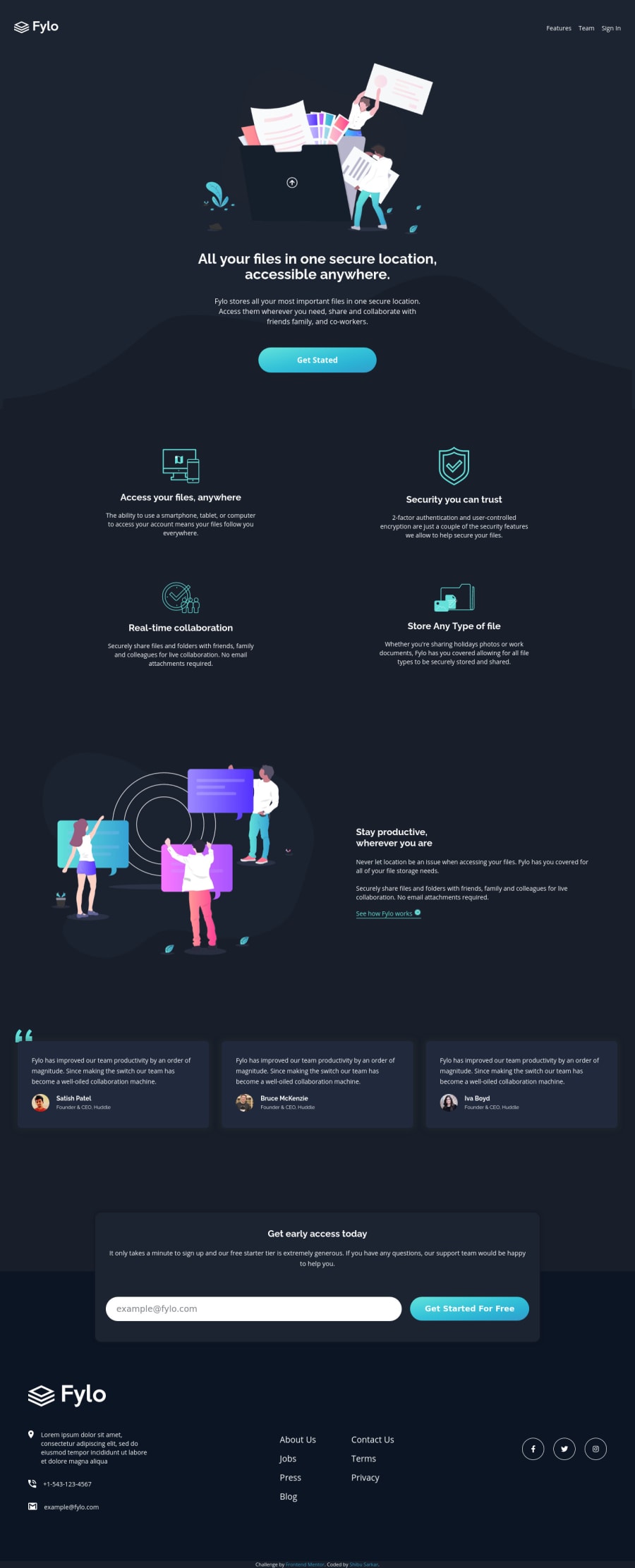
Mobile first- Fylo dark theme landing page (html,css)
@shibuwd
Design comparison
SolutionDesign
Solution retrospective
I really appreciate it if you left feedback.
Community feedback
- @kecavPosted over 3 years ago
Great Job ! Tune it a bit.. like add max width constraints in CSS. I'll suggest to use 'rem' in font-sizes and make it little accessible to all devices. You've done a great job.
Marked as helpful2@shibuwdPosted over 3 years ago@kecav Thanks for the suggestions. I will definitely do it for the upcoming project. Thanks again for your kind comment.
1 - @Amanpatil-DevPosted over 3 years ago
Hello SHIBU, Your solution responds well and Everything looks good to me 👍
Maybe Just Selecting a good font-family would make it look more good
Happy coding😃
Marked as helpful0
Please log in to post a comment
Log in with GitHubJoin our Discord community
Join thousands of Frontend Mentor community members taking the challenges, sharing resources, helping each other, and chatting about all things front-end!
Join our Discord
