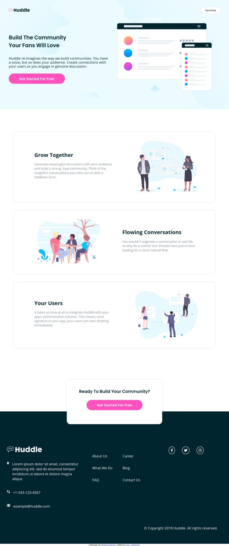
Mobile First Frontend Mentor | Huddle landing page
Design comparison
Solution retrospective
Everything looks good but if I have done any mistake then let me know because I'm beginner and waiting for your most valuable feedback
Community feedback
- @grace-snowPosted over 3 years ago
Hello
Well done on this, it looks good.
The main areas for your code improvement are in html structure I think. I am only viewing on a phone though, so it's hard to check more details...
- learn how to write good alt text and when to leave the attribute blank. One of the logo images is blank at the moment, even though a logo is alway highly valuable content, and all other alt values would be unreadable to assistive technology at the moment (because all in one word with hyphens etc). Even without the hyphens in a readable format, those values don't describe the images
- it looks like you are wrapping things in divs a lot more than you need to.... Only give an element a wrapper if it needs it. Some you may need, but I'm sure there are some unnecessary ones in there
- see if you can improve the sectioning semantics on this a bit more. There's a header and footer, which is a good start. Does it need other tags? (maybe, optional)
- content like telephone no and email should always be marked up as links. People expert to be able to click those.
- the two lists in the footer should be one list. Look into css column properties to split into two columns
- this list should be in a nav element. That's the only nav on the page, so it's important
- social icons would be clickable, so again wrap in links (anchor tags), set to open in a new window (as these are external) and make sure they have an accessible name/label to say where the link goes.
- those social icons look a bit distorted. I'd give an explicit width and height to ensure they stay circular
- remember you can import all the fonts in one link rather than two
- remember to include clear focus-visible styles in css (I haven't looked to see if you have already)
Anyway, well done again and keep on coding 👏
3@grace-snowPosted over 3 years agoI just had a very quick glance at your css and need to ask
Why are you doing this?
font-size: 43.75%;(on the html)Do you understand the huge accessibility implications from doing that? What are the reasons?
1@grace-snowPosted over 3 years agoLast thing - please Indent Code consistently. It's really hard to read at the moment 😉
1@snake321Posted over 3 years ago@grace-snow Thank you so much for your feedback It helped me a lot to improve my code I will try my best to overcome these mistakes which you have told me again thank you so much for your feedback
0@snake321Posted over 3 years ago@grace-snow
The reason I wrote it to make my rem = 7 pixels as you know that 1rem is = 16px so that's why I used 43.75% which is = 7px and in tablet style 50% which is = 8px in small laptop ,desktop 56.25% which is = 9px and for large desktop 62.5% which is equal to 10px
I did this because now when ever I will access my mobile style, tablet style and desktop style then my all properties width and font size will be increased automatically according to size
should I do this again or there is any another best way to do this ?....
0@grace-snowPosted over 3 years ago@snake321 It is best to never change the root font size. It can make sites completely unreadable for people with vision problems who need to have larger text. They use different technology and zoom settings to make text 200% - 400% larger. If you've shrunk down the base size like that it can break all sorts for them. That's why it's best not to change set defaults that are standard cross-browser. It's better to change font size on the body (in rem) if you need to, so the original rem size hasn't been changed.
On the point of knowing what 1 rem is at each breakpoint, I don't see any benefit. There is no need to know what a rem equals at any screen size or change it at different screen sizes... You might need to change the body font size for huge displays, but not rems, and there is little reason to change even font sizes between personal devices.
You'll probably find it helpful to stop thinking in terms of pixels at all. Think of screen space and the sizes of items relative to each other. I use rem for everything that you might automatically think to do in pixels, that way every bit of a design scales appropriately, not just text. Just an idea.
If you use sass you can have a simple function that you use everywhere to generate rem using a pixel size from a design. So I write
rem(20px)and get1.25remoutput automatically in the css (20/16)I hope that makes some sense, I'm tired and not sure I'm explaining it well. 😂
0
Please log in to post a comment
Log in with GitHubJoin our Discord community
Join thousands of Frontend Mentor community members taking the challenges, sharing resources, helping each other, and chatting about all things front-end!
Join our Discord
