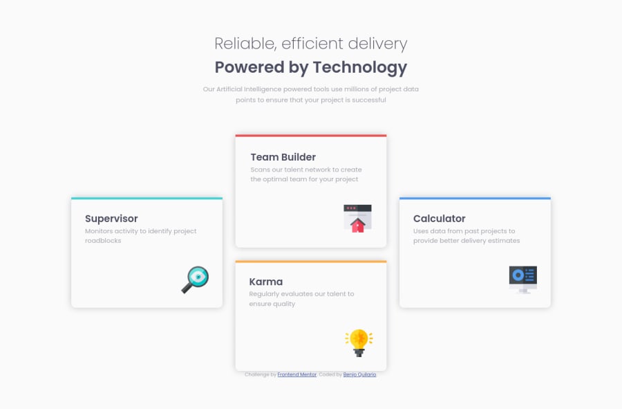
Mobile first - Four card features section(HTML-CSS/SASS) with clamp
Design comparison
Solution retrospective
Hello! This is my 8th fem challenge. My mobile first web, any feedback and suggestion is welcome
Community feedback
- @ApplePieGiraffePosted over 3 years ago
Hello, Benjo Quilario! 👋
Good job on this challenge! 👏
A small suggestion I have is to add a max-width to the feature cards so that they do not grow in width and end being different sizes when the width of the screen increases in the desktop layout of the site. 😉
Keep coding (and happy coding, too)! 😁
Marked as helpful1@benjoquilarioPosted over 3 years ago@ApplePieGiraffe Thank you for suggestion APG 🔥😊
1 - @palgrammingPosted over 3 years ago
The solid color change on hover looks a little too strong and also makes the text in the cards harder to read
Marked as helpful1@benjoquilarioPosted over 3 years ago@palgramming hahaha about that one, I only play around when I'm almost finished, It seems I need to remove it or make it half the color from the bottom.
Btw. Thanks for the suggestions 👍🔥
0@palgrammingPosted over 3 years ago@benjoquilario yes that looks much better with just the bar of color at the bottom. Now it all looks like it belongs...
Also about 1040px wide you do have your left and right card over flowing the browser window
0@benjoquilarioPosted over 3 years ago@palgramming I will change the
grid-templates-column: repeat(3, 1fr)so that It will not overflow, but It will changes sizes of the given design.0
Please log in to post a comment
Log in with GitHubJoin our Discord community
Join thousands of Frontend Mentor community members taking the challenges, sharing resources, helping each other, and chatting about all things front-end!
Join our Discord
