MOBILE FIRST FOUR CARD FEATURE SECTION WITH FLEXBOX

Solution retrospective
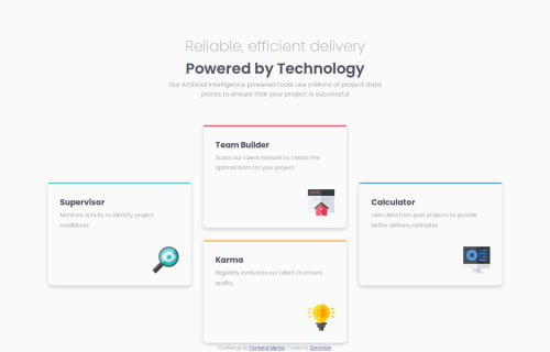
This challenge was a bit challenging, especially, what I am guessing would be the most challenging part for any newbie, changing the 4 sections from column layout to a 2-way layout. I'm curious to see how others went about tackling it. I'm sure there's a better way than the one I used but I am proud of the way I handled it. It made everything seem basic if you put it that way. A simple flexbox in a bigger flexbox. Asides that, I had issues with responsiveness and scaling which I hope to improve upon.
What specific areas of your project would you like help with?How to improve on responsiveness
Please log in to post a comment
Log in with GitHubCommunity feedback
No feedback yet. Be the first to give feedback on why-not-phoenix's solution.
Join our Discord community
Join thousands of Frontend Mentor community members taking the challenges, sharing resources, helping each other, and chatting about all things front-end!
Join our Discord