Design comparison
Solution retrospective
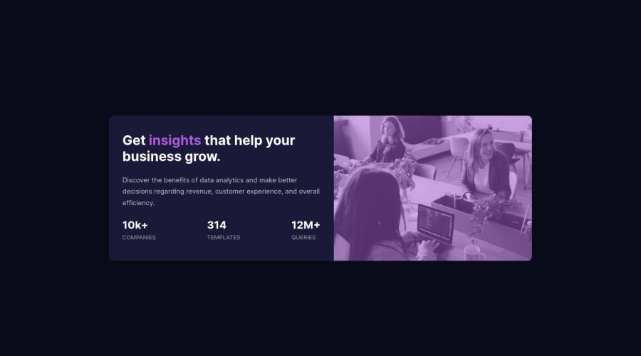
please, look at the css of the image at both the mobile and the media query for the laptop and tell me if the image is deformed or not, and let me know if there is another approach to handle images with out loosing their ratio...
Community feedback
- @pikapikamartPosted about 3 years ago
Hey, awesome work on this one. Layout in desktop looks great just needed for it to bit bigger. The site is responsive and the mobile layout looks great as well.
CyrusKabir already gave a great suggestions, going to add some as well:
- The
.stat-containerselector could use anulelement since those are "list" of information about the company website. - Each text-content should be inside a meaningful element like
ptag and not justdiv. - Lastly, the
.attributionneeds to be insidefooterso that it is inside a landmark element.
To be honest the site looks really great and the markup looks great as well. Really great work on this one.
Marked as helpful0 - The
- @CyrusKabirPosted about 3 years ago
hello my dear friend ♥ your did good and clean at all but here some problems :
- you need have more white space in your card content i mean it's not look like main design
- you need change the white space between the numbers it's a lot
- you can use filter property or background-blend-mode because you can get closer to design with these things but liner gradient it's just hard you know
Marked as helpful0
Please log in to post a comment
Log in with GitHubJoin our Discord community
Join thousands of Frontend Mentor community members taking the challenges, sharing resources, helping each other, and chatting about all things front-end!
Join our Discord
