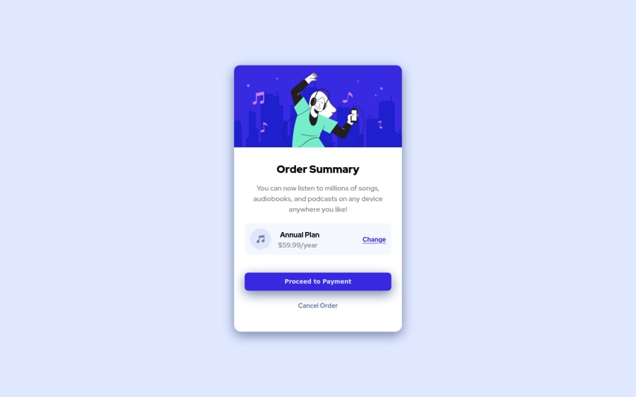
Design comparison
Solution retrospective
Hello from almost sunny Prague!
I have updated my solution of order summary component with the advices and tips from the community's feedback.
Hope it is better now.
Keep coding!
Community feedback
- @vanzasetiaPosted about 3 years ago
Greetings, Iva! 👋
Congratulations on finishing this challenge! 🎉 It's great to know that you care about accessibility.
Regarding your questions:
- When I was a FREE member, all I did was open a new tab and display the design image. Then I just kept switching back and forward, comparing it with my site. 😆 The other thing that you can do is put all the design images on the design tool like Figma and try creating a box to kind of measure the size. Jessica Chan known as Coder Coder use Adobe XD to measure the size of the element when doing the Easy bank landing page challenge.
- I would recommend using the correct native HTML element. There's no need for a
roleattribute as long as you can use the native HTML markup. I also recommend doing a lighthouse audit before you upload your solution. It also will test the accessibility of your site. Also, there's an article from Scott O'Hara about landmarks.
I notice that you have written a note in the
style.cssfile. That's great! 👍 It would be helpful if you put it in theREADME.mdso that people can learn it too. By doing that, it's also showing your knowledge and it's always a good thing.Also, I would recommend focusing on the quality of the code instead of trying to make your solution as pixel-perfect as possible. As long as it looks similar to the original design, then I think it's perfectly fine.
That's it! I hope this information is useful! Happy coding! 😁
Marked as helpful1@IvuskaPosted about 3 years agoHello @vanzasetia,
thank you for your feedback and particular tips! :-) I will go through them and bear them in my mind and further development process of my challenges and projects :-)
1 - @grace-snowPosted about 3 years ago
This looks pretty good to me. A few tips
- try to get box shadow more like the design
- content is hitting all sides of my phone screen. Some padding on body or margin on the card should sort that
- make sure text is always in meaningful elements. Price isn't in a paragraph atm
- I'd make annual plan a heading tbh, but that's your choice
- curious - why is proceed a button and change an anchor tag? What do you expect to happen with each of those?
- I'm not sure the alt text of the first image really describes it... Something like "illustration of a woman enjoying listening to music and dancing". You never need to include words like "image of" in alt descriptions (it's already an img element)
- no need for font-size: 16px; on the body element. That's the default anyway. If you did change font size on there it's essential for it to be in rem not px
- whenever you have interactive elements it's important to include focus visible styles, not just hovers. Very important for keyboard users - make them nice and obvious like a bold outline
Hope this is helpful
Really nice to see learning notes in this, well done
Marked as helpful1@IvuskaPosted about 3 years agoHi @grace-snow,
thank you very much for your feedback, will update the solution according to them :)
0 - @Ayon95Posted about 3 years ago
Hi, your solution looks good. It's a bit tricky to guess the dimensions of elements accurately from images alone. There's a screenshot-taking software called Greenshot that you can use to measure distances and such. The PerfectPixel Chrome extension is also useful. It allows you to put an image overlay on top of the coded website. You can use it to compare the design with the actual website.
As for good accessibility practices, use semantic HTML elements appropriately whenever you can. Get familiar with some commonly used ARIA attributes and when they are necessary (MDN has an article on each of them). If you're using Windows, you can download NVDA screen reader to test how a screen reader reads your website.
- PerfectPixel
- Greenshot
- W3C Accessibility Tutorials
- The A11Y Project
- ARIA Attributes
- NVDA screen reader
Hope this helps :)
Marked as helpful1@IvuskaPosted about 3 years agoHi @Ayon95,
thank you so much for the tips and the exact links! :-) I will go through them and try to include them in my development process for the nexta challenges and projects.
1@Ayon95Posted about 3 years ago@Ivuska Sure, no problem. Good luck on your future projects :)
1 - @GitHub-dev12345Posted about 3 years ago
used this CSS Property in your card to increase and decrease the size of card:
1.In Card design CSS Code Used this:
transform : scale(0.8); this property decrease the size of card. 😉
large size for increase the number of scale & small size for decrease the number of scale
And used this code for background image : In body tag used this CSS property: body{ background : url("./images/uesd image path") no-repeat; background position: top center; background size: 100% 50%; ( this is your choice check the image performance, and the gave the size percentage on your choice); this code very helpful for your background image😉😎 keep it up; } this code helpful for you, plz click on the mark the helpful
0
Please log in to post a comment
Log in with GitHubJoin our Discord community
Join thousands of Frontend Mentor community members taking the challenges, sharing resources, helping each other, and chatting about all things front-end!
Join our Discord
