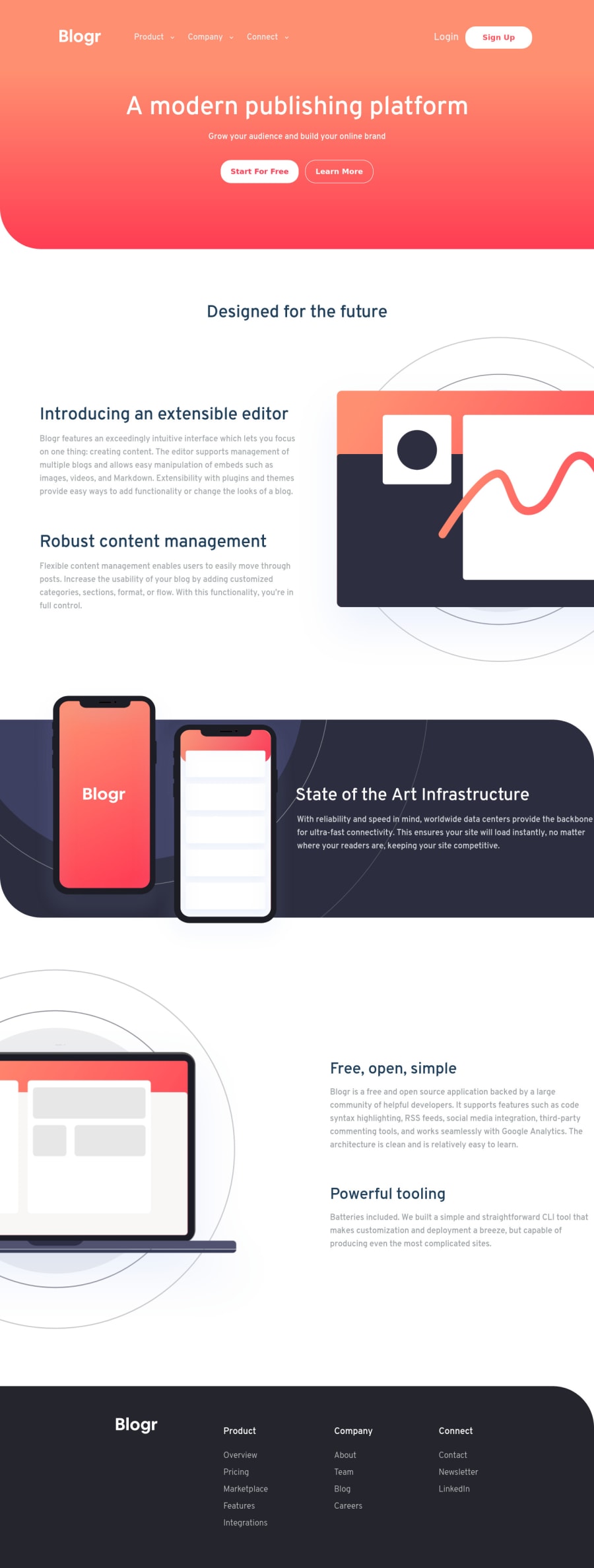
Mobile First (FLEXBOX + MEDIA QUERY + Responsive dimensions)
Design comparison
Solution retrospective
Trying to make the design as responsive as I can from past few weeks. Nowadays limiting myself to use only rems, %, min-height, min-width etc. I though this challenge will be tough but as the journey begins all things were getting clear and I enjoyed it throughout. The main task was to make the required nav bars for both mobile and desktop. The javascript was not that complex as the approach idea was clear in my mind. The thing I am struggling was with background images. So I skipped the circle part on the section1. I think I have done it pretty good but have made html part little bit complex (mainly because of nav section). Any suggestion to improve the efficiency is welcome.
Community feedback
Please log in to post a comment
Log in with GitHubJoin our Discord community
Join thousands of Frontend Mentor community members taking the challenges, sharing resources, helping each other, and chatting about all things front-end!
Join our Discord
