Submitted about 3 years ago
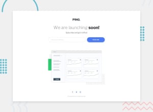
Mobile First (FLEXBOX + MEDIA QUERY) + less fixed heights and widths
@imparassharma
Design comparison
SolutionDesign
Solution retrospective
Recently I have started working on responsive designs which have use of paddings, % , em , rem etc. Any suggestion to improve in that will help me a lot.
Community feedback
Please log in to post a comment
Log in with GitHubJoin our Discord community
Join thousands of Frontend Mentor community members taking the challenges, sharing resources, helping each other, and chatting about all things front-end!
Join our Discord
