Submitted over 2 years ago
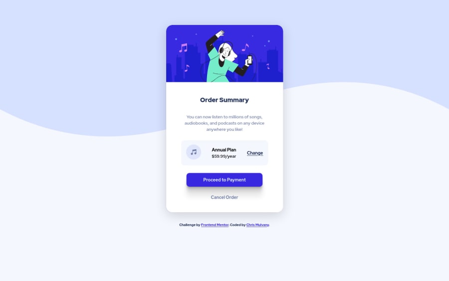
Mobile First Flexbox CSS Order Summary Card
@ChrisMulvanyGH
Design comparison
SolutionDesign
Solution retrospective
All constructive feedback welcomes
Community feedback
- @denieldenPosted over 2 years ago
Hey Chris, congratulations on completing the challenge! You did a great job 😉
Let me give you some little tips for optimizing your code:
- To fix the top image in the background just put more specific background properties to the body:
background: url("../img/pattern-background-desktop.svg") no-repeat top center; background-size: contain; background-color: #e0e8ff;- remove all unnecessary code, the less you write the better as well as being clearer: for example the
headertag and thedivcontainers of image - remove all
marginfromcontainer, main and bodyelements - use flexbox to the body to center the card. Read here -> best flex guide
- after, add
min-height: 100vh and margin: 0to body because Flexbox aligns child items to the size of the parent container - instead of using
px and %use relative units of measurement likerem-> read here
Hope this help! Happy coding 😁
Marked as helpful0 - @ChrisMulvanyGHPosted over 2 years ago
Thanks Deniel
Excellent tips very much appreciated.
- Length of code is definetely something I will be refining.
margingreat tip and will set-up a default CSS/SCSS file with this info.display: flexon the body for some reason I never thought of this. Thanks for the link.pxand%, I have started usingremandemsbut for some reason don't have them set-up in the project, I'll make sure to ammend.
Brilliant advice!
Regards
Chris
0
Please log in to post a comment
Log in with GitHubJoin our Discord community
Join thousands of Frontend Mentor community members taking the challenges, sharing resources, helping each other, and chatting about all things front-end!
Join our Discord
