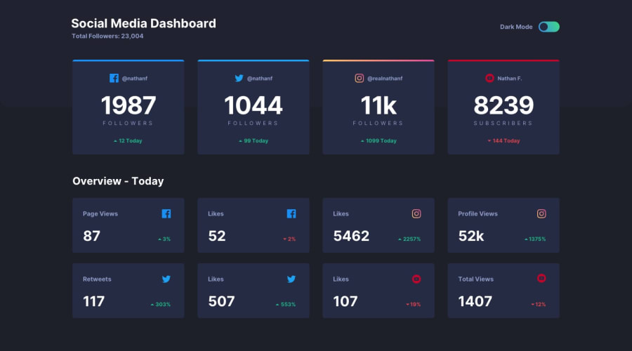
Design comparison
Solution retrospective
I am tried this challenge using transition to give a little animation effect. I think I should have approached the solution in a different way for changing theme. Will appreciate any suggestion. :)
Community feedback
- @tedikoPosted over 3 years ago
Hello, SAMIR HEMBROM! 👋
Congrats on finishing another challenge! Your solution looks very good and also responds well. There is nothing that I can add actually, it is really good solution! Maybe one thing I spot is that you unnecessarily create new class
.card-rectanglefor elements that are looking same like.card. If you want to change several cosmetic styles use modifier since you're using BEM. so your card-rectangle could be.card .card--overviewor something like that.Good luck with that, have fun coding! 💪
1@samirhembromPosted over 3 years ago@tediko Ya, I will try that. Thanks for mentoring me always.
0 - @palgrammingPosted over 3 years ago
Looks great ⭐⭐⭐⭐⭐
1
Please log in to post a comment
Log in with GitHubJoin our Discord community
Join thousands of Frontend Mentor community members taking the challenges, sharing resources, helping each other, and chatting about all things front-end!
Join our Discord
