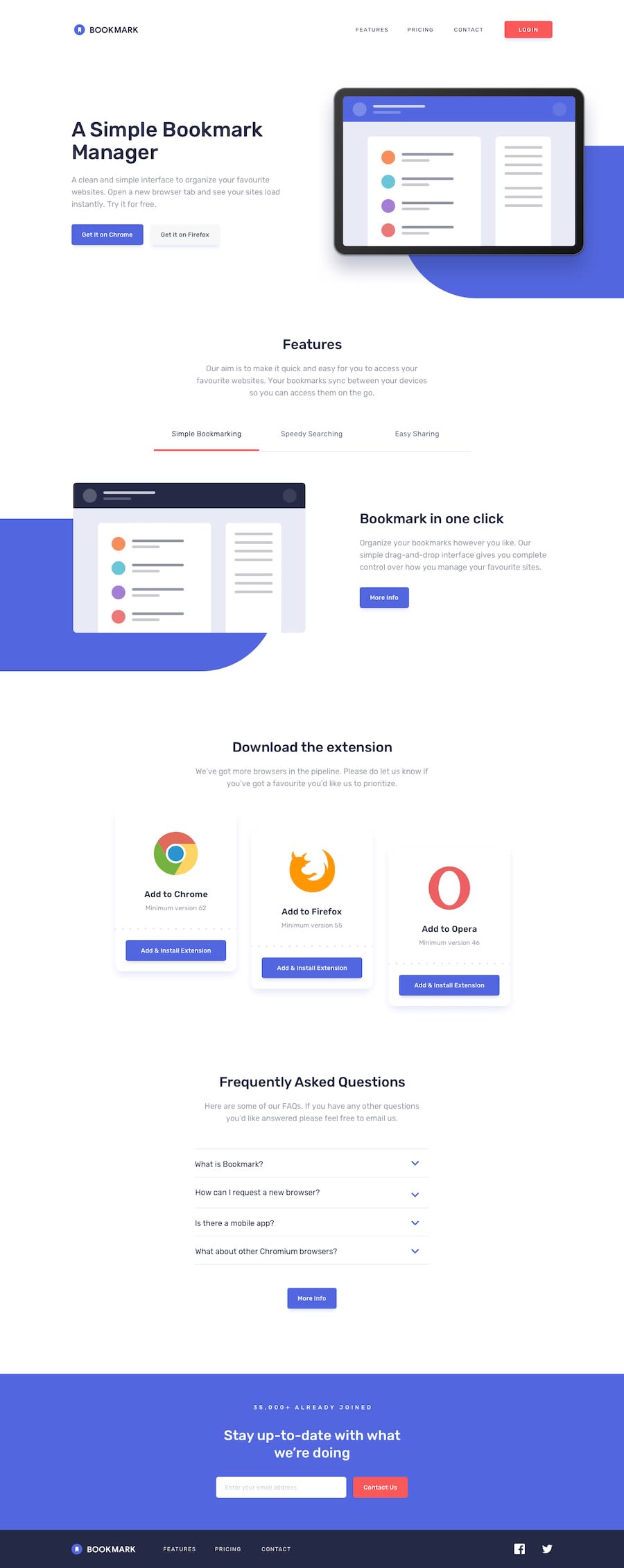
Design comparison
Solution retrospective
Hello everyone!
So finally challenge completed with hover states for all interactive elements and receive an error message when the newsletter form is submitted.
It would be really great if anyone review my code cause i think it could be shorten or if any one done this challenge before please give me link. i would love to analyse the code and improve my skills.
Any other suggestions are also welcomed.
Thank you.
Community feedback
- @ChamuMutezvaPosted over 3 years ago
Looks good on mobile, we'll done. For the menu hamburger and close button - they need to be really buttons or use Wai-aria attributes on the current elements so that assistive technology users maybe able to use them
Marked as helpful0@drajnishPosted over 3 years ago@ChamuMutezva Thank you for your suggestion. I will remember this.
0
Please log in to post a comment
Log in with GitHubJoin our Discord community
Join thousands of Frontend Mentor community members taking the challenges, sharing resources, helping each other, and chatting about all things front-end!
Join our Discord
