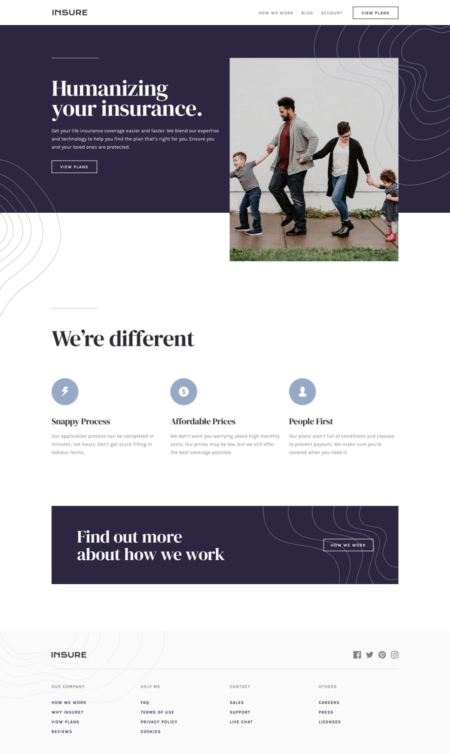
Design comparison
Solution retrospective
-
I had a problem with the backgrounds and I couldn't solve it, none of them worked in the files and that's why I didn't put it, none of the backgrounds worked and i dont know why
-
I added a dark and light theme as a personal touch, I did it to practice since I was just learning it and I don't know if it's wrong to put it in the challenge or not, so if it's wrong sorry I won't do it next time
I also changed the menu a bit and used a library for the hamburger button
Other than that, I don't think I had any problems.
Maybe how to improve my code and other things but I leave that to you who can give me all kinds of advice :)
Community feedback
- @SamadeenPosted over 2 years ago
Hey!! Cheers 🥂 on completing this challenge.. .
Here are my suggestions..
- Go down orderly when you are using the headings h1 down to h2 down to h3 and so on.
- You can wrap your attribution section in a footer tag to avoid accessibility issues.
This should fix most of your accessibility issues
You can check out my solutions to improve your challenge
. Regardless you did amazing... hope you find this useful... Happy coding!!!
0@Raul-code1Posted over 2 years ago@Samadeen Thanks for the tips 😃 I appreciate it so much, hope I can keep improving i will look at your challenge solution...happy coding 🖥️
0
Please log in to post a comment
Log in with GitHubJoin our Discord community
Join thousands of Frontend Mentor community members taking the challenges, sharing resources, helping each other, and chatting about all things front-end!
Join our Discord
