Design comparison
Solution retrospective
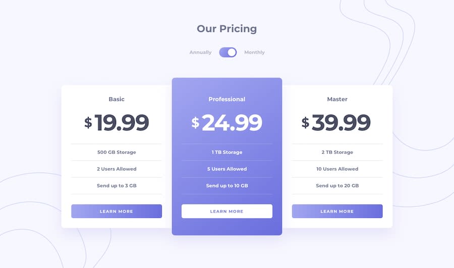
Should I use a fixed height to increase the height of the card in the middle or use scale function to increase the size of the card?
Community feedback
- @tedikoPosted over 3 years ago
Hello, SAMIR HEMBROM! 👋
Congrats on finishing another challenge! Your solution responds well and looks good. Happy that you apply my last suggestion. What I'd suggest you this time is:
- Instead of multiple paragraphs use unordered list
<ul>for .card__text. - Also, the HTML
<hr>element represents a thematic break between paragraph-level elements i think there is better approach to this line effect.border-bottomon.card__textshould be good.
Good luck with that, have fun coding! 💪
2@samirhembromPosted over 3 years ago@tediko You're very helpful, thanks again for the suggestion. I need to work on my html code and find more meaningful elements for the design.
0 - Instead of multiple paragraphs use unordered list
- @MojtabaMosaviPosted over 3 years ago
Alternatively you could add extra padding to the middle card with a modifier.
1@mattstuddertPosted over 3 years agoYeah, I'd go down this route as well. All other content is the same size; the middle column is just a little taller.
I'd recommend avoiding setting fixed heights on elements except in particular instances where you have a clear reason. Set heights can cause real problems with content overflow, especially when dealing with responsive sites.
1@samirhembromPosted over 3 years ago@MojtabaMosavi Thank you, I shall use padding instead of trying to give fixed heights.
0@samirhembromPosted over 3 years ago@mattstuddert Yes, the content inside the card seemed to be taller too. It seems the height had effect on the heights of the font and height of the button.
0
Please log in to post a comment
Log in with GitHubJoin our Discord community
Join thousands of Frontend Mentor community members taking the challenges, sharing resources, helping each other, and chatting about all things front-end!
Join our Discord
