Design comparison
SolutionDesign
Solution retrospective
What are you most proud of, and what would you do differently next time?
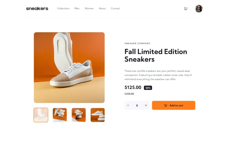
I'm very proud that I did mobile first workflow, but I would think better when I have like the same components like the gallery and analyze how to make it reusable, but sometimes is better to repeat yourself a little bit.
What challenges did you encounter, and how did you overcome them?I was having struggle with svgs, I finally manage to resize them adding viewbox to the svg.
What specific areas of your project would you like help with?Maybe how to reuse the css for the gallery in desktop, mobile and on the overlay.
Community feedback
Please log in to post a comment
Log in with GitHubJoin our Discord community
Join thousands of Frontend Mentor community members taking the challenges, sharing resources, helping each other, and chatting about all things front-end!
Join our Discord
