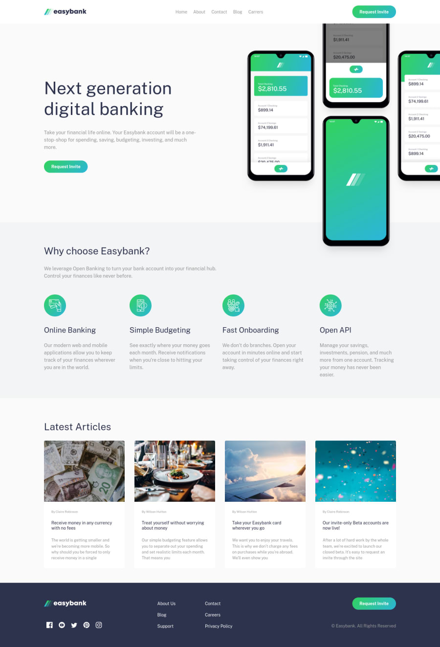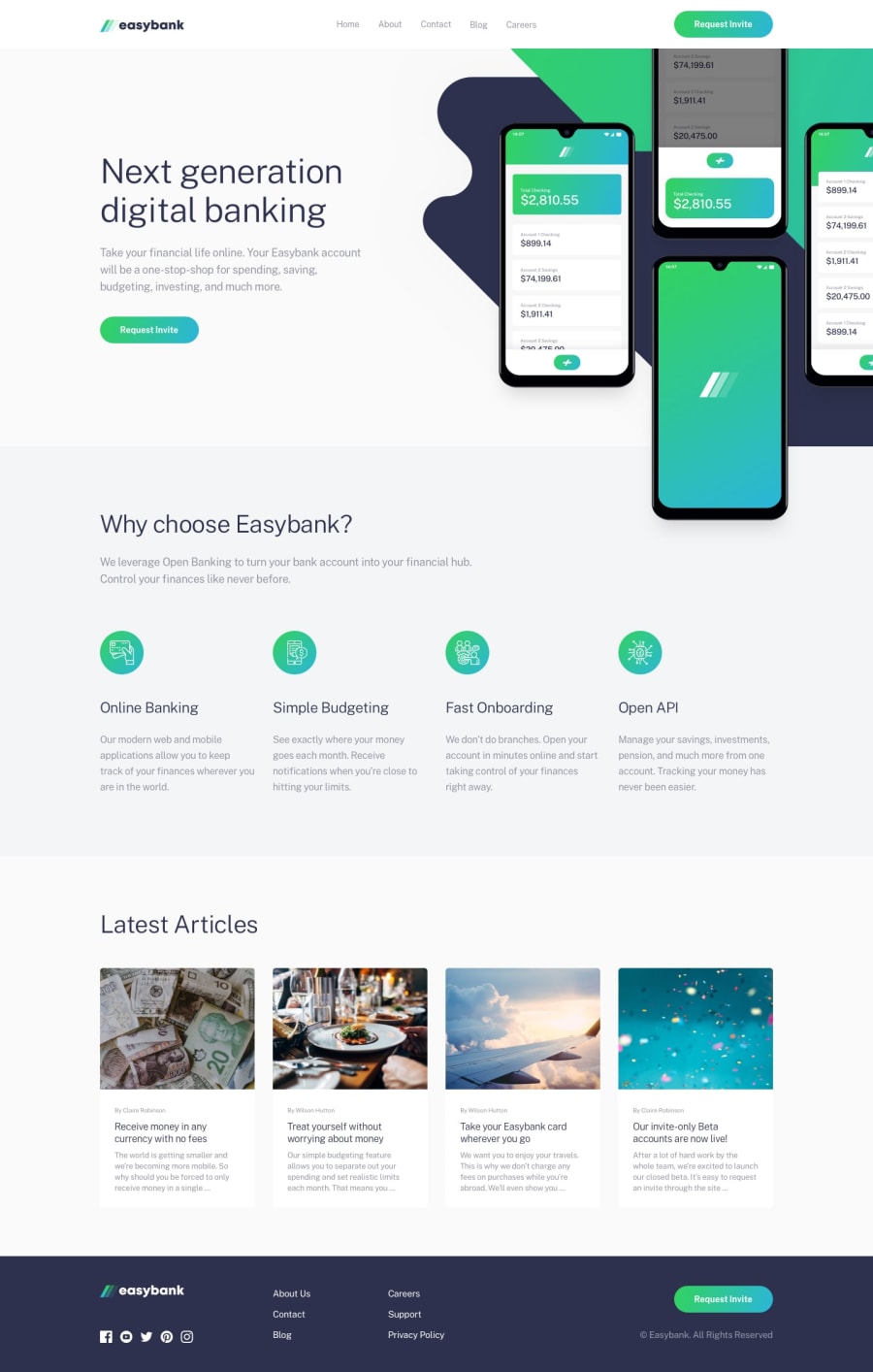
Design comparison
Solution retrospective
Some general workflow tips would be greatly appreciated!
- the background image part was the hardest and it burnt me out. Decided to drop it off for now. All I was doing is guessing some
background-positionvalues, it was not consistent. I don't know whybg-intro.svgwas scaled so much in desktop layout and wasn't optimized for the design in the first place - didn't add dark gradient background on mobile menu, since I was burnt out
- the font sizing felt very fixed even when using rems, the sizes were very specific in the design and I had to set
font-sizeon many elements across different layouts just for small changes. Maybe it would be better if I'd usedclamp()
Overall I still enjoyed this challenge and I'm happy how it looks, didn't go over Sass though and it might be little messy, just wanted to submit and get done with it to be honest, even though I always like make everything as clean as possible.
Once project size grows its hard to revisit old styles and make improvements, even when using 7 in 1 rule (I think that's what it's called)
Please log in to post a comment
Log in with GitHubCommunity feedback
No feedback yet. Be the first to give feedback on eagermonument81's solution.
Join our Discord community
Join thousands of Frontend Mentor community members taking the challenges, sharing resources, helping each other, and chatting about all things front-end!
Join our Discord
