Submitted over 3 years ago
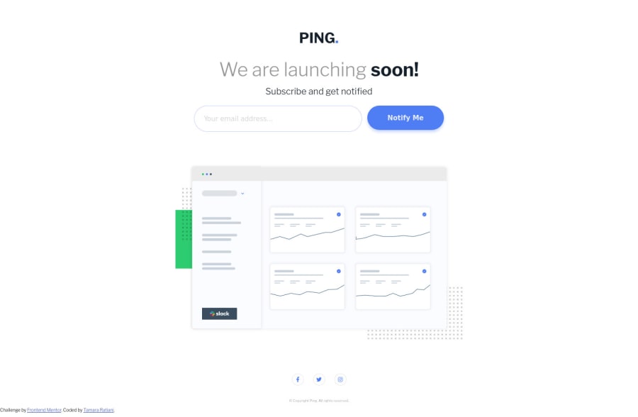
Mobile first. (desktop and other devices with media query) , used flex
@Tamarchika
Design comparison
SolutionDesign
Solution retrospective
I ll be glad for any tips or advices from frontend developers ^ ^
Community feedback
- @ApplePieGiraffePosted over 3 years ago
Greetings, Tamarchika! 👋
Nice work on this challenge! 🙌
A few things I suggest are,
- Taking a look at your solution report and trying to clear up the error that is there (by labeling the input element in some way) in order to improve the accessibility of your solution.
- Increasing the font-size of the error message (since it is a bit small (and therefore potentially difficult to read for some) in the mobile layout of the site).
- The social media icons near the bottom of the page might benefit from being boosted in size a bit, too, to make them slightly easier to tap on touchscreen devices. 😉
Hope those tips help. 😀
Keep coding (and happy coding, too)! 😁
1
Please log in to post a comment
Log in with GitHubJoin our Discord community
Join thousands of Frontend Mentor community members taking the challenges, sharing resources, helping each other, and chatting about all things front-end!
Join our Discord
