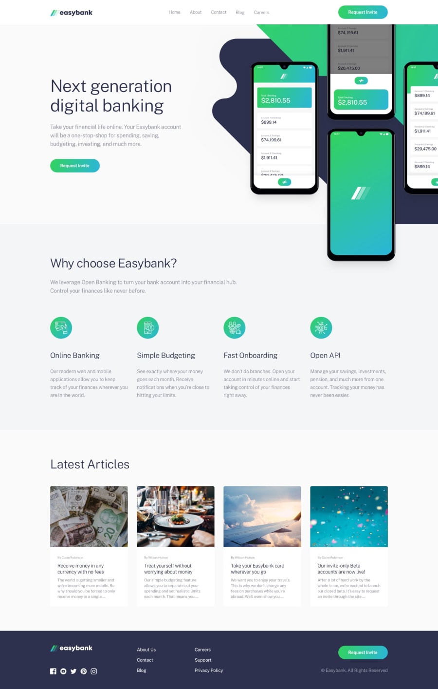
Mobile first design with vanilla css and js
Design comparison
Solution retrospective
No specific question but please feel free to leave any comments or feedback on how I could've improved the code or the design.
Community feedback
- @SathishVMPosted over 4 years ago
Hello adluders,
Yeah you did a nice solution.I found only one thing that you can improve too. That is on service and article section paragraph line-height.
By increasing the line-height it will not hard to read. So,That's my only one feedback. :)
1@just-a-devguyPosted over 4 years ago@sathishvm Hey, thanks! any suggestions on what I should make the new line-height? I tried different values and they either seemed too much or too little. Is it a small increase you think or should it be a significant increase?
0@SathishVMPosted over 4 years ago@adluders small increase for the desktop view only and for the mobile view it's ok. ✌️
1@just-a-devguyPosted over 4 years ago@sathishvm Gotcha! I'll make that update, if my laziness does not win :D but thanks for the feedback. I appreciate you taking the time to reply :)
0 - @ovidiuantonioPosted over 4 years ago
Hello,
Nice solution! You did a very good job! I found a few things that you can improve to make the solution even better:
- the nav's color, change it to white, if you hover over the links they will have white bg but the nav is a grayish color and that's weird
- add hover states for the 'Request Invite' button and the social links at the bottom
Happy coding! Keep going!
1@just-a-devguyPosted over 4 years ago@ovidiuantonio Hey, thanks so much for taking the time to give me the feedback. Regarding the nav, I did not add any color to it so it's default to the browser, are you saying I should explicitly add white to it? And the links should not have a new background color on hover, I will double check that one (facepalm). I will also double check the 'Request Invite' buttons on the design to see how the active state looked like. For the life of me, I don't think I even double checked that (double facepalm) Thanks again for the feedback, but let me know if you mean I should add white or not...
0
Please log in to post a comment
Log in with GitHubJoin our Discord community
Join thousands of Frontend Mentor community members taking the challenges, sharing resources, helping each other, and chatting about all things front-end!
Join our Discord
