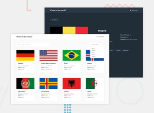
Design comparison
Community feedback
- @JustShuaibPosted over 2 years ago
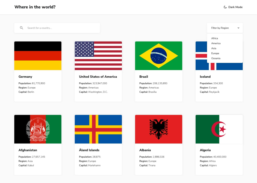
Hi there, I noticed that while searching for countries, if there is let's say only two countries that match the search criteria, there is usually a space between them. You can search for korea to better see what I am talking about.
Also, if I am searching and there is no country that matches my search parameter, it will be nice to have a text that says country not found or something similar. Instead of a blank screen.
It also seems like the
filter by regionisn't showing the full country list. It's only showing 8 countries when I filtered Africa. In fact, the landing page shows only 8 countries.Nice work though
Marked as helpful0@dsnoeijerPosted over 2 years ago@JustShuaib Hi, thank you for your feedback.
During development i indeed limited the results to 8, i forgot to change it back to full. I have updated the solution to include all results. I've also fixed the spacing issues you mentioned, as well as adding a message when there are no results.
0
Please log in to post a comment
Log in with GitHubJoin our Discord community
Join thousands of Frontend Mentor community members taking the challenges, sharing resources, helping each other, and chatting about all things front-end!
Join our Discord
