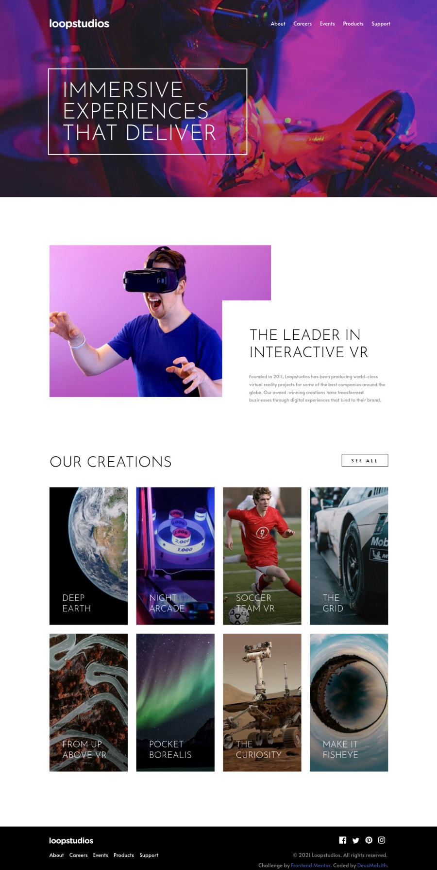
Mobile first design utilizing Flexbox, Grid, JS, and transitions


Design comparison

Solution retrospective
I enjoyed doing this challenge and learned a lot but it definitely proved to me that for my next challenge I'll definitely be planning how I lay out my HTML structure. I ran into a bunch of problems that required hacky fixes and, unfortunately, unoptimized CSS (probably could cut the CSS by a third at least if I went back and refactored) just to meet the goal. Mobile was the easiest but the styling up the desktop design is where I ran into issues that will require some refactoring.
I do have a question for everyone in the community though: What do you all use for getting your design as pixel perfect to the final design? For a while I've been using GIMP with the measure tool but I honestly hate using GIMP. And while Krita is amazing it has a terrible measurement tool for this use case. I looked into some chrome extensions for getting measurements but I just haven't found anything great.
Community feedback
Please log in to post a comment
Log in with GitHub
Join our Discord community
Join thousands of Frontend Mentor community members taking the challenges, sharing resources, helping each other, and chatting about all things front-end!
Join our Discord