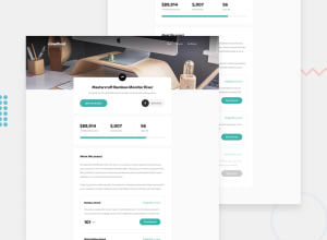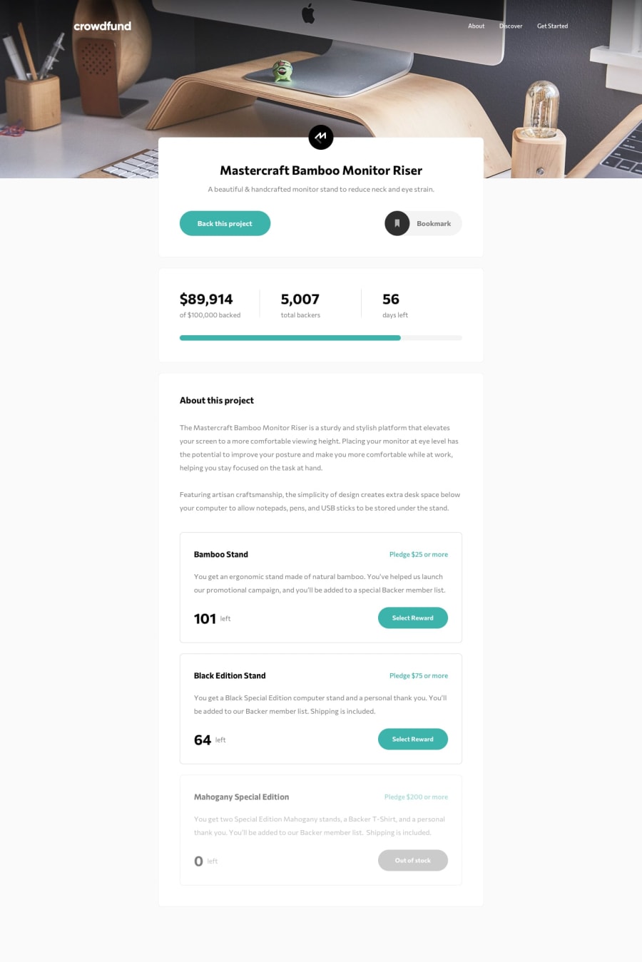
Design comparison
Solution retrospective
Any feedback is welcome!
Community feedback
- @Yashasvi2704Posted over 3 years ago
Hi Roshan,
Great work! Good to see a slight variation from a flat to Shadow UI. It fits well I have to say.👌
Specially the gradient on the on the hero section. It makes the navigation a whole lot readable compared to the low contrast navigation of the actual design.
If I am being Nit-picky, sorry for that but the white space in the cards of the actual design is looking a little bit better😋
Kudos!
Marked as helpful0@Rosh-PyPosted over 3 years ago@Yashasvi2704 Hey Thanks Yashasvi for the appreciation! Did you mean line height by whitespace?
0@Yashasvi2704Posted over 3 years ago@Rosh-Py By white spaces I mean the padding and margins (blank space around items to give them more room to breathe) around the items..
For example.. the space between the heading and paragraph of the cards
0@Rosh-PyPosted over 3 years ago@Yashasvi2704 Thanks again for letting me know. :) I get your point.
0
Please log in to post a comment
Log in with GitHubJoin our Discord community
Join thousands of Frontend Mentor community members taking the challenges, sharing resources, helping each other, and chatting about all things front-end!
Join our Discord
