Submitted over 4 years ago
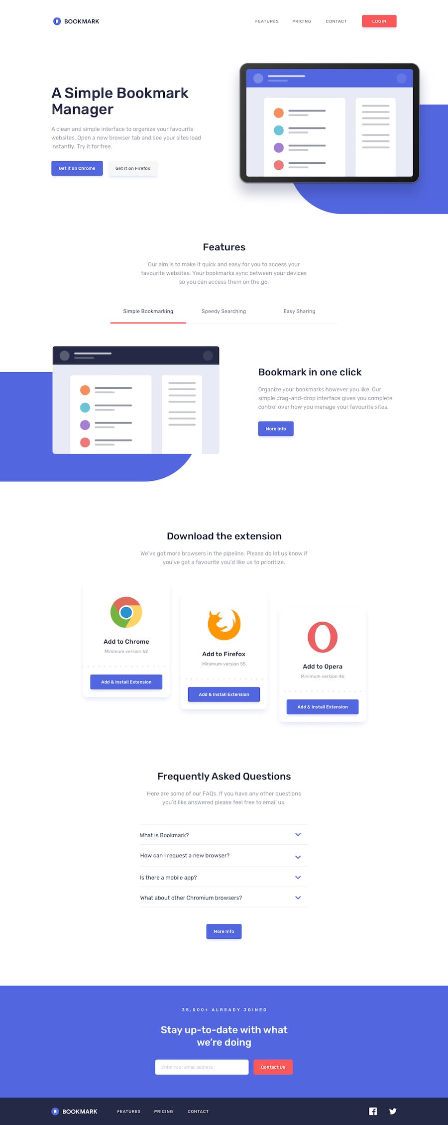
Mobile first design using HTML, CSS grid and Javascript
@MilitusInnocent
Design comparison
SolutionDesign
Solution retrospective
Hi guys, this is my first challenge and I am quite excited to have completed it even though it is far from perfect. I would appreciate feedbacks and encouragements.
Again! This is my first and I'm so excited.
Community feedback
- @ovidiuantonioPosted over 4 years ago
Hello,
Pretty nice work for your first solution! There are a few things that you can improve to make the solution even better:
- add more padding between the sections
- for the nav especially, try to make the links the same color and font-size as the original
- change the text color for the buttons that need that and make sure to remove the default border on all buttons, as for the hover effect on the buttons, try to make the button not that big, just a few pixels bigger is enough
- add
cursor: pointer;on the clickable elements
Happy coding! Keep going!
1@MilitusInnocentPosted over 4 years ago@ovidiuantonio Thank you! I so much appreciate the feedback. I'll work harder on everything you just pointed. Once again, great thanks.
0
Please log in to post a comment
Log in with GitHubJoin our Discord community
Join thousands of Frontend Mentor community members taking the challenges, sharing resources, helping each other, and chatting about all things front-end!
Join our Discord
