Design comparison
Solution retrospective
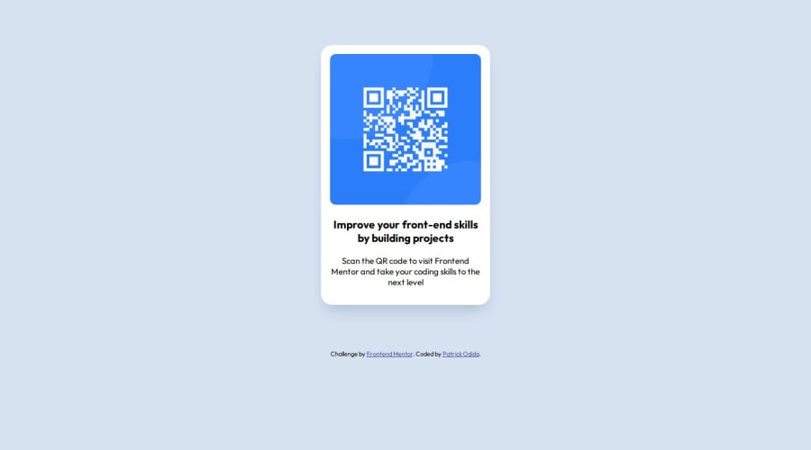
While building this component, I used an <h3> heading for the first part of the sentence and a <p> element for the second part. Is it best practice to do that, or should I have used a <p> element throughout and a <span> element for the second part of the sentence? Thanks.
Community feedback
- @danielmrz-devPosted 10 months ago
Hello @Patrickodida!
Your project looks great!
I have a couple of suggestions for you to improve it even more:
- Using
marginis not the best option to center an element. Here's a very efficient (and better) way to place an element in the middle of the page both vertically and horizontally:
📌 Apply this to the body (in order to work properly, don't use position or margins):
body {
    min-height: 100vh;
    display: flex;  /* it works with grid too  */
    justify-content: center;
    align-items: center;
}
📌 Also, in order to make your HTML code more semantic, don't skip heading levels - start with
<h1>, then use<h2>, and so on. Unlike what most people think, it's not just about the size and weight of the text.- The
<h1>to<h6>tags are used to define HTML headings. <h1>defines the most important heading.<h6>defines the least important heading.- Only use one
<h1>per page - this should represent the main heading/title for the whole page.
All these tag changes may have little or any visual impact but they make your HTML code more semantic and improve SEO optimization as well as the accessibility of your project.
I hope it helps!
Other than that, great job!
Marked as helpful0@PatrickodidaPosted 10 months agoHello @danielmrz-dev!
Thank you for this advice.
I have actually used this particular approach you have cited when displaying HTML elements side by side, but not for this kind of project.
This morning, I gave it a shot, and it actually works perfectly.
I have also had issues choosing the right tags to use in my HTML, but thank you for the clarifications.
0 - Using
- @rawannmmohamedPosted 10 months ago
i would suggest using <h1> for the first part and give it the size you want and <p> for the second part .. it is better for accessibility to start with <h1> rather than <h3> .
and span will create an inline element it won't be good to use it in this case.
for more accessibility tips read this :
https://www.frontendmentor.io/articles/10-fundamental-web-accessibility-tips-for-frontend-developers-rUurADGxCt
Marked as helpful0@PatrickodidaPosted 10 months agoHello @rawannmmohamed!
Thank you for the clarification on the tags and also the resources shared.
I am going to read through!
0 - @jgreen721Posted 10 months ago
Your approach of
<h3>and<p>tags was a good one. I'm not going to pretend to be an expert but the span element is a specialinlineelement and isn't so much related to text-size. Inline meaning it won't 'block' down to the next level. A simple manner I'd use in is with-in a text element where you'd like to style a portion of the text differently.<h3 class='red-text'>Here is some text to be red, <span class='fadein-animation'>this part can fade-in </span> but this and the beginning portion wont.</h3>lol, dumb example but hopefully it helps a little. Certainly no shortage of long winded explanations on all of the elements to learn more but yea, your approach here was good.
Marked as helpful0@PatrickodidaPosted 10 months agoHello @jgreen721!
Thank you for the clarification on the use of <span>. I actually understand the example, and it has cleared my doubts.
I have also received advice regarding the usage of heading tags and how it's not good practice to skip heading tags. This means, in this particular case, I should have used an <h1> tag instead of an <h3> tag. It's because this makes the code more semantic and improves SEO, as well as accessibility.
1 - @Alokray007Posted 10 months ago
Hello there 👋
Good job on completing the challenge !
Your project looks really good!
I have a suggestion about your code that might interest you.
There is an very useful browser extension called Perfect Pixel that allow you compare with the design image and thus see the exact dimensions. I recommend it to you.
📌 Tags like <div> and <span> are typical examples of non-semantic HTML elements. They serve only as content holders but give no indication as to what type of content they contain or what role that content plays on the page. This tag change does not impact your project visually and makes your HTML code more semantic, improving SEO optimization as well as the accessibility of your project.
I hope this suggestion is useful for future projects.
Other than that, great job!
Happy coding.
0@PatrickodidaPosted 10 months agoHello @Alokray007!
Thank you for your quality feedback.
And about the browser extension, I can't wait to give it a try in my next project.
0
Please log in to post a comment
Log in with GitHubJoin our Discord community
Join thousands of Frontend Mentor community members taking the challenges, sharing resources, helping each other, and chatting about all things front-end!
Join our Discord
