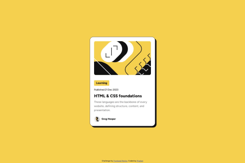
Mobile-First Design using CSS Flexbox and Grid Layours

Solution retrospective
The main areas of feedback would be appreciated for how I implemented my CSS styles.
Please log in to post a comment
Log in with GitHubCommunity feedback
- @ShoaibShuja
Amazing job my friend and the layout seem to be perfectly designed and even though you didn't use media queries the layout seems to be responsive and works for smaller devices.
For now I have two tips for you:
-
First of all you do not need to create a lot of properties as a variable if you are not going to use it several times
-
And second don't forget to add media queries which it's function is basically making the page responsive and work in different types of devices.
Good luck and have a beautiful day.👍
-
- @araujocardoso1010
Looks good


Join our Discord community
Join thousands of Frontend Mentor community members taking the challenges, sharing resources, helping each other, and chatting about all things front-end!
Join our Discord