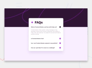
Mobile-first design using bootstrap and flexbox
Design comparison
Solution retrospective
I was able to do it in under 3 hours. I thought it was going to take me a lot more to do it.
What challenges did you encounter, and how did you overcome them?How to travel through the DOM, I had to check on some documentation and review some previous courses to get to do it correctly.
What specific areas of your project would you like help with?DOM traversing is an area that I need to keep working on to get better at it
Community feedback
- @cleyrolscPosted 5 months ago
Hello @ChamuMutezva, thank you very much for the feedback. I highly appreciate it. I will start looking into this things moving forward.
When it comes to the unit used, usually the desings come with px instead of rems/ems, would it be a good practice to simply convert them, or still use them as instructed?
0@ChamuMutezvaPosted 5 months ago@cleyrolsc ,
The design is just a guide , apply any techniques including converting any values for font sizes to rems.
Marked as helpful0 - @ChamuMutezvaPosted 5 months ago
Hi Cleyrol Santana
I have gone through your project, here is some issues to look at:
- One of the images has the following alt value
alt="star-icon", in my opinion this image should have an empty value because it is just a decorative image. An alt value has more to do with the content of the image (the message carried in the image) rather than what the image is. The alt value has to be descriptive such that in the event that the image fails to load , the meaning presented by the image will still be clear. - Use semantic html where possible to improve the accessibility of the site, the elements that you used for the questions and answers are not accessible when using a keyboard. The user should be able to use a keyboard only if that's the preference of the user. One quick solution is to use the details summary element. You may then not need the javascript
- Generally , it is important to set
min-height: 100vh;on the body element instead ofheight: 100vh;, as that allows content to be scrollable if it does not fit the body. - The main element has
width: 380px;, explicit sizes can cause responsive issues , where like in this case devices under 380px will not be able to view the page in full - Font sizes should be in either rems or em, see the following article for a detailed explanation font sizes
0 - One of the images has the following alt value
Please log in to post a comment
Log in with GitHubJoin our Discord community
Join thousands of Frontend Mentor community members taking the challenges, sharing resources, helping each other, and chatting about all things front-end!
Join our Discord
