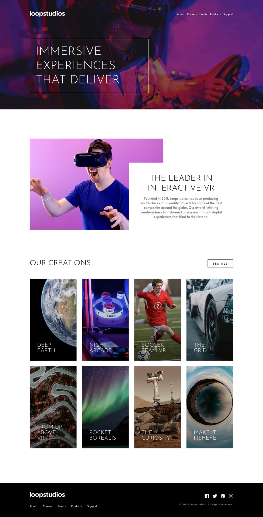
Mobile first design using BEM and SASS built using Parcel
Design comparison
Solution retrospective
I was planning on trying Tailwind here but can't make it work with parcel and sass.
Any ideas how to make it work?
🌸Any feedback is appreciated!🌸 🙏Thanks! 🙏
Community feedback
- @ApplePieGiraffePosted almost 4 years ago
Hi there, iMervinC! 👋
Nice to see you complete another challenge! 😀 Good job on this one! 🙌 Your solution looks good and is responsive! 👍
I'd just noticed that the mobile navigation menu icon jumps downwards a bit when the menu is opened—I think keeping the menu icon in the same place when the menu is open/closed would be a good idea! 😉
Of course, keep coding (and happy coding, too)! 😁
1 - @abhik-bPosted almost 4 years ago
Hi @iMervinC 👋 Fantastic job on this challenge , your solution is responsive and it looks & feels amazing ✨
** Just some opinions **
- I liked the hover transitions 🔥💯
- I liked the mobile nav animations
- increasing the
gap(maybe to2rem) can make the desktop nav look more nice ! - for iPad devices (screen sizes > 768 && <1024) footer becomes too tall , to avoid that footer ul can have
flex-direction:rowand the parentdivofulcan havetext-align:centerso the logo is centered
Happy coding & Keep contributing these fantastic solutions 🚀
1
Please log in to post a comment
Log in with GitHubJoin our Discord community
Join thousands of Frontend Mentor community members taking the challenges, sharing resources, helping each other, and chatting about all things front-end!
Join our Discord
