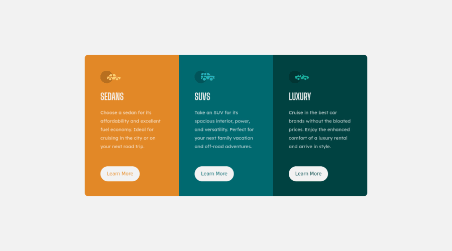


Design comparison
SolutionDesign

Solution retrospective
Any feedback will be appreciated.
Community feedback
- @NitaLewskaPosted almost 4 years ago
Hi! =)
- It seems you've forgotten to add active button states
- When screen width is about 700 px, there is no free spaces on the sides, check it =)
Nevertheless, you've made a good job =)
Marked as helpful0@adashleoPosted almost 4 years ago@NitaLewska Hi thanks for your feedback, I've added the active buttons and fixed the bugs. Please have a look :)
1@NitaLewskaPosted almost 4 years ago@adashleo
Active buttons are great, there are free spaces now, but text "learn more" goes lower, outside borders =)
https://drive.google.com/file/d/143zwWkeiYFg_I5_Tap-W_kHhqGKbgdra/view?usp=sharing
0

Please log in to post a comment
Log in with GitHubJoin our Discord community
Join thousands of Frontend Mentor community members taking the challenges, sharing resources, helping each other, and chatting about all things front-end!
Join our Discord