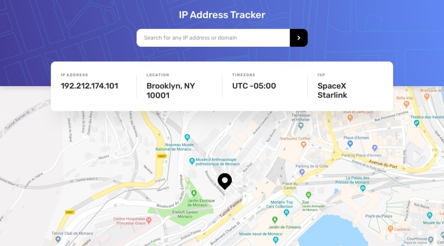
Design comparison
SolutionDesign
Solution retrospective
I need your comments and opinions on what I need to improve, thank you
Community feedback
- @mbart13Posted over 3 years ago
Hi, I think you need
background-size: coveron your background image to get rid of that sudden change in headerother than that looks good, I'm doing same challenge btw
0@robertoms99Posted over 3 years agohaha if I did not pay much attention to the layout or the skin, to be pending to use the api. Good point, cover
0
Please log in to post a comment
Log in with GitHubJoin our Discord community
Join thousands of Frontend Mentor community members taking the challenges, sharing resources, helping each other, and chatting about all things front-end!
Join our Discord
