Submitted over 2 years ago
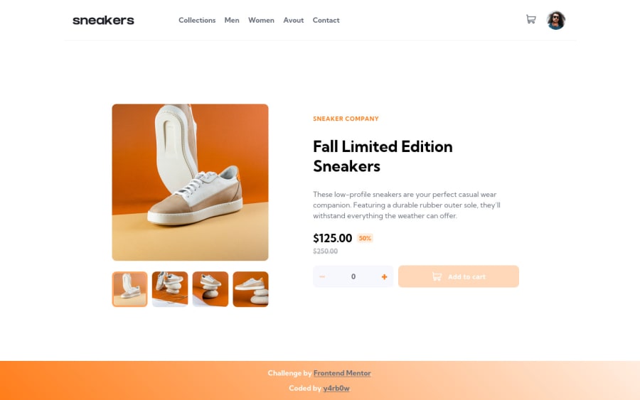
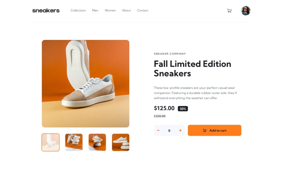
Mobile first CSS HTML pure JS training layout management (grid & flex)
@Yavanha
Design comparison
SolutionDesign
Solution retrospective
Hello everyone,
Finally my first intermediate project, it was very instructive.
Please if you want to give me any feedback, I would appriciate if you mainly focus on HTML & CSS. That's what I'm currently working on.
The JS I did something very quickly to make it work, can be improve a lot :).
Thank you
Community feedback
Please log in to post a comment
Log in with GitHubJoin our Discord community
Join thousands of Frontend Mentor community members taking the challenges, sharing resources, helping each other, and chatting about all things front-end!
Join our Discord
