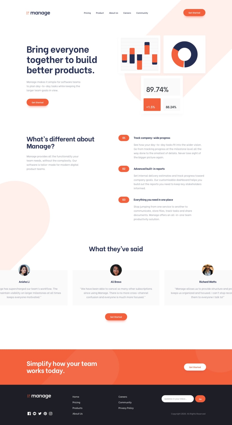
Mobile firsT, CSS Grid, Flex box and a little JS
Design comparison
Solution retrospective
I would love your honest feedback.
Also, I need help on how to give class names I really suck at doing so.
I would also love if anyone could tell me the standard screen sizes for devices
Community feedback
- @kseniusPosted over 4 years ago
My honest feedback, as you asked:
First of all, you overuse buttons. You don't need to use the button tag for every element that resembles a button. Particularly in the landing page you've build I would use the button tag only in the subscription form in the footer. Secondly, I'd recommend you to learn more about flexbox, I've quickly looked through your style.css and it seems like you use it incorrectly (e.g. lines 476 and 490). I would also recommend to avoid deeply nested selectors.
As for class names, you need to search for CSS naming conventions, choose one of them and stick to it. For example, there are BEM (Block, Element, Modifier), OOCSS (Object Oriented CSS, if I'm not mistaken) and some other CSS naming conventions of which I don't know much, but Google does :)
2
Please log in to post a comment
Log in with GitHubJoin our Discord community
Join thousands of Frontend Mentor community members taking the challenges, sharing resources, helping each other, and chatting about all things front-end!
Join our Discord
