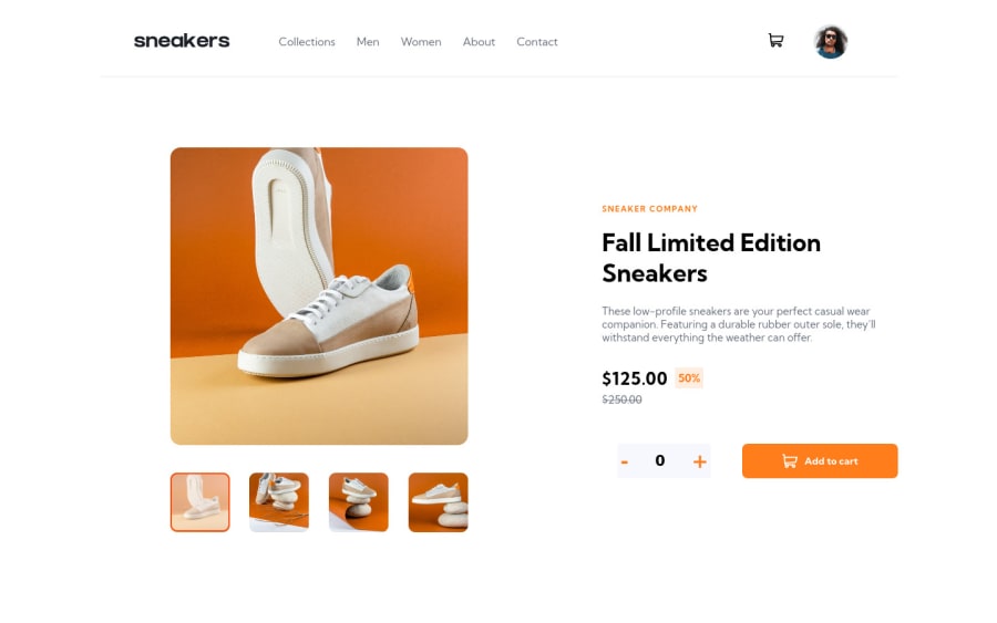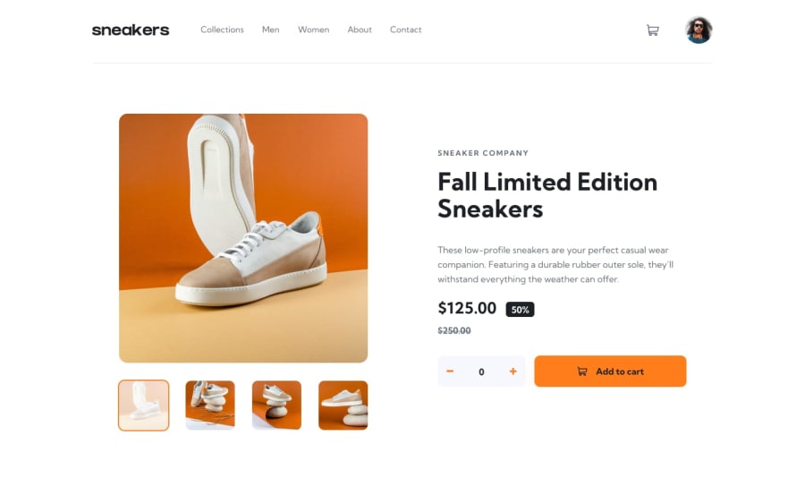
Design comparison
SolutionDesign
Solution retrospective
Hey , So Happy to be back to coding, please rate my work, any advices are welcomed.
Community feedback
- @TagviPosted about 3 years ago
You need to add some padding to the thumbnails, also you can see that in the provided design, the navbar does not completely stretch to the ends of the website, text is kinda big IMO, also when I add items to the cart twice they don't add up, they just get re-added :)
Marked as helpful1
Please log in to post a comment
Log in with GitHubJoin our Discord community
Join thousands of Frontend Mentor community members taking the challenges, sharing resources, helping each other, and chatting about all things front-end!
Join our Discord
