Mobile-first, CSS, Flexbox, and responsive design.


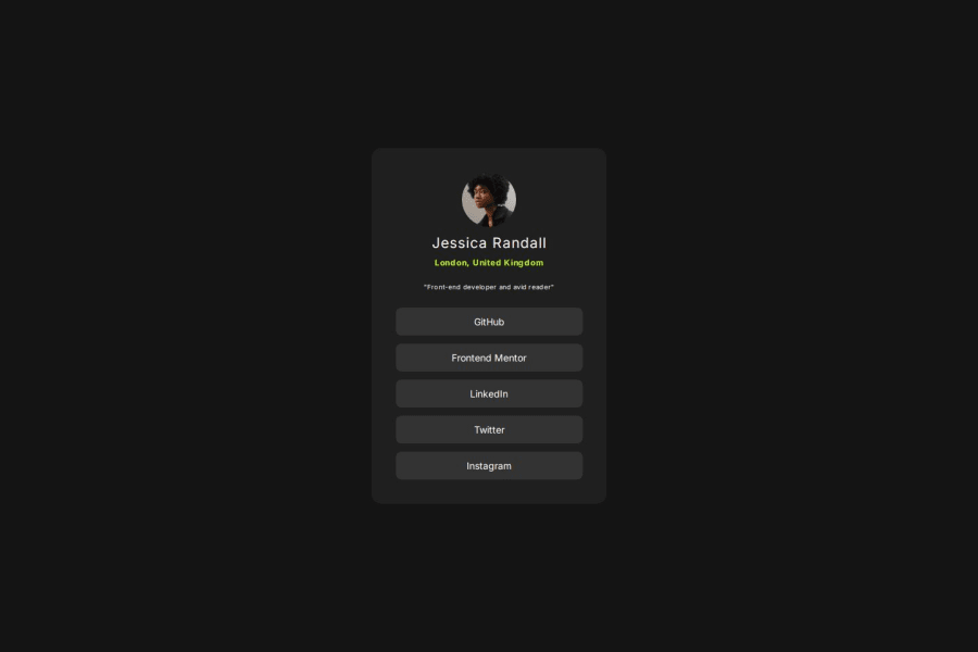
Design comparison

Solution retrospective
I’m proud of creating a clean, responsive layout with hover and focus states for better interactivity. Next time, I would refine my CSS organization for improved scalability.
What challenges did you encounter, and how did you overcome them?CSS layout and responsiveness were challenging, but I overcame them by using a mobile-first workflow and experimenting with Flexbox properties.
What specific areas of your project would you like help with?I would appreciate feedback on how to further improve the structure and readability of my CSS, particularly for navigation and hover effects.
Community feedback
- @dylan-dot-cPosted 4 months ago
Hey bro, this is a really good solution, semantic html code and everything looks good!
One thing you can do is make the
min-height: 100vhinstead of just the height value seeing that on some small or even rotate mobile devices it will get cropped off.Also for
transition: background-color 0.3s, color 0.3s;you could just usetransition: all 0.3s;for shorter code.This is good and I would like if you could give me some feedback on how I can improve my solution!
0

Please log in to post a comment
Log in with GitHub
Join our Discord community
Join thousands of Frontend Mentor community members taking the challenges, sharing resources, helping each other, and chatting about all things front-end!
Join our Discord