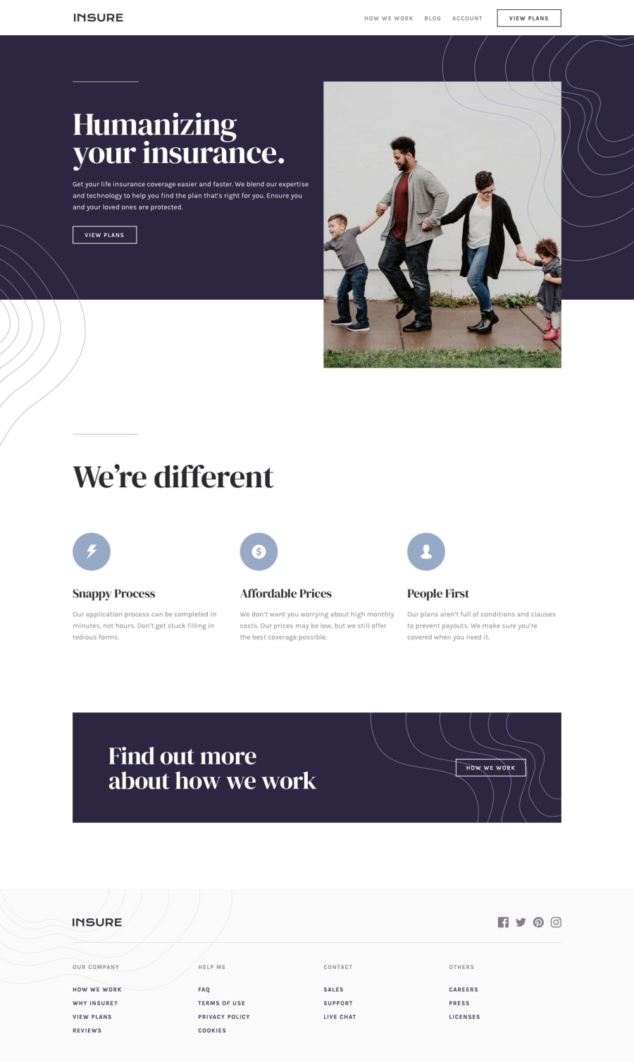
Design comparison
Solution retrospective
Did my best on this one, I'd love some feedback :)
Community feedback
- Account deleted
Under 1400px the picture disappears and reappears again at 800px, don't know why you did that.
And returning to desktop while the mobile menu is still active makes it totally disappear.
Marked as helpful0@SaifN97Posted about 3 years agoHey @thulanigamtee,
-About the picture, I thought it looked cleaner with just the text rather than stretching the mobile version image, And for the desktop I had to take it out because of absolute positioning as it was taking over the text on smaller screens.
-I think the mobile menu bug is related to stacking context because I used positioning on the hero section on bigger screens, I noticed the menu is just below everything.🤣 Can you give me some suggestions to fix this?
Thanks for your feedbacks :)
0 - @ebbscodePosted about 3 years ago
great work on the design.
0
Please log in to post a comment
Log in with GitHubJoin our Discord community
Join thousands of Frontend Mentor community members taking the challenges, sharing resources, helping each other, and chatting about all things front-end!
Join our Discord
