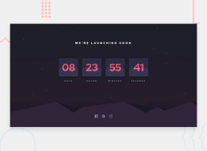
Mobile first countdown timer with BEM and Sass
Design comparison
Solution retrospective
Hello members of frontend mentor community,
I have completed yet another intermediate challenge. This one took me around 2 months to complete😅. I couldn't get the animation quite right. So if you've got any improvement suggestions, I'm open. Any other feedbacks are also appreciated.
Community feedback
- @RioCantrePosted almost 3 years ago
Hello there! Awesome job with this challenge! Viewing your solution, you did well with the design and functionality. I would suggest the following for you..
- Adjust the bottom margin of the icons in the
.social__iconsinto4rem - Import the
attributionstyle in the CSS file and removestyletag - You can simplify the footer icon with this HTML structure...
<li class="social__icon">
          <a href="#" class="icon icon--facebook"></a>
 </li>
Over all you did well and Keep up the good work!
Marked as helpful0@Yemisrach15Posted almost 3 years ago@RioCantre Thanks for the feedback Rio🙏🏾. I could simplify the footer as you said but when I tried it, the mask image is invisible. That's why I had to add an empty div.
1@RioCantrePosted almost 3 years ago@Yemisrach15 I see. Makes sense. Well you did a good job on this project. Keep it up!
1@yishak621Posted almost 2 years ago@Yemisrach15 the flip animation should be smooth
0 - Adjust the bottom margin of the icons in the
- @denieldenPosted almost 3 years ago
Hi Yemisrach, congrats on completing the challenge!
I had a look at your solution and I have a few suggestions to improve your code:
- Try to use Flexbox for center the element in the page: read here ->Flex guide Note: Flexbox aligns to the size of the parent container.
- To fix the position of the hill image in the background change the value of
background-sizeincontain. - Try to adding a little
transitionon the socialhovereffect - In javascript avoid using
innerHTMLunless strictly necessary: its use creates a security hazard. Rather useinnerTextwhich is the same thing but does not parser html [read here] (https://www.w3schools.com/jsref/prop_node_innertext.asp)
In the end Instead of using 4 identical functions that perform the same task but with different times, try to use only 1 function by passing it the different parameters.
Overall you did well :) keep it up and Happy coding!
Marked as helpful0@Yemisrach15Posted almost 3 years ago@denielden Thank you Deniel. I appreciate🙏🏾. On your first point, is it necessary to use flexbox to center elements? And can you point out where I should use it on my solution?
1@denieldenPosted almost 3 years ago@Yemisrach15 it's not necessary to use flexbox to center elements but is very simple use it and offer much control.
In this case you should be use it onwrapperclass or to thebodyYou can se in my solution here application -> my solution
Happy coding!
1@Yemisrach15Posted almost 3 years agoYes you are right. I'm more familiar with
margin: 0 autoto center elements. And nice solution!1
Please log in to post a comment
Log in with GitHubJoin our Discord community
Join thousands of Frontend Mentor community members taking the challenges, sharing resources, helping each other, and chatting about all things front-end!
Join our Discord
