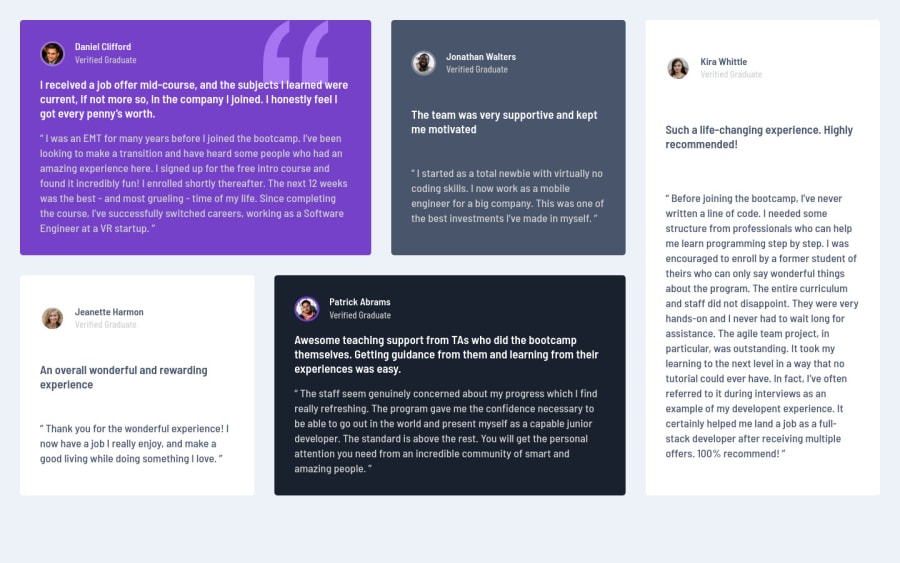
Design comparison
Solution retrospective
Hi all, I'm happy with the overall result, especially having been able to change le layout for mobile/tablet and desktop. But I encountered a few issues:
1)How do I make my content centered in the page ? I used a .main to put all my content into on which I set display: grid and place-items: center hoping it would help but it didn't. And margin:auto doesn;t seem to do it.
-
How do I force my cards to be wider rather than higher while using grid-template-areas ?
-
Can I make the content adapt to the container rather than the container adapt to the biggest content box ?
Thanks a lot for any answer regarding those but also any suggestions to make my coding better overall !
Community feedback
- @KtGitItPosted over 3 years ago
Hello Mallory 👋🏼,
You did the great job on this. It looks good on various screen sizes. I will try to answer some of your issues.
-
To make "main" div center, you need to give main container some kind of width. I would give max-width 1200px or something around that range and then change margin: 8-9rem auto and that should work. Play with it in dev tool in your browser!!
-
Remove the min-width from card div and that will make it better.
3)Once you have width(max-width) on your container then content box will adjust to it. I hope that is what you asking.
Your code is easy to read but I would be caution using h2 before h1 for semantic reasons.You can do more research on semantic html and find out more about it.
Best regards and keep coding, KT
1@azerroth11Posted over 3 years ago@KtGitIt Hi there, thanks for your feedback !
I did as suggested and it helped but when it comes to my boxes becoming wider, removing the min-width and setting a max width seem to make the matter worse !
Regarding the h2 & h1, would it be better to use a h1 first, lower its font size and then h2, increasing its font size rather than h2 then h1 ?
Thanks in advance !
0@KtGitItPosted over 3 years ago@azerroth11 You are correct about h1 & h2. You can always change font sizes when you style them. [Check out this article] (https://webaim.org/techniques/semanticstructure/)
Regarding your cards just remove the min-width and don't add any width at all. I misunderstood you question-3. when you said container and content, i thought you were asking about the main-container. 😂 my bad. I believe cards will adjust according to it contents. When I did this challenge, I didn't add any widths to those cards as well.
1 -
Please log in to post a comment
Log in with GitHubJoin our Discord community
Join thousands of Frontend Mentor community members taking the challenges, sharing resources, helping each other, and chatting about all things front-end!
Join our Discord