Submitted about 4 years ago
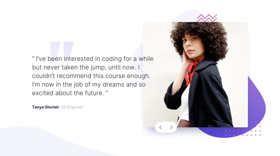
mobile first coding bootcamp testimonial with vanilla javascript
@Degoke
Design comparison
SolutionDesign
Solution retrospective
Your feedback would be appreciated, boxshadow🙈
Community feedback
- @ApplePieGiraffePosted about 4 years ago
Hi, there, Degoke! 👋
Good work, once again! Your solution looks pretty good and is responsive! 👍
I suggest,
- Making the color of the review text darker (as in the original design) so that it stands out against the background of the page and is easier to read.
- Not decreasing the opacity of the slider buttons upon hover (since that makes them slightly less easy to see) but setting
cursortopointerfor them instead. - Allowing users to cycle through the reviews by continually pressing one of the slider buttons would be a nice touch!
Keep coding (and happy coding, too)! 😁
0@DegokePosted about 4 years ago@ApplePieGiraffe Thank you for the suggestions 😊, ill implement them
0
Please log in to post a comment
Log in with GitHubJoin our Discord community
Join thousands of Frontend Mentor community members taking the challenges, sharing resources, helping each other, and chatting about all things front-end!
Join our Discord
