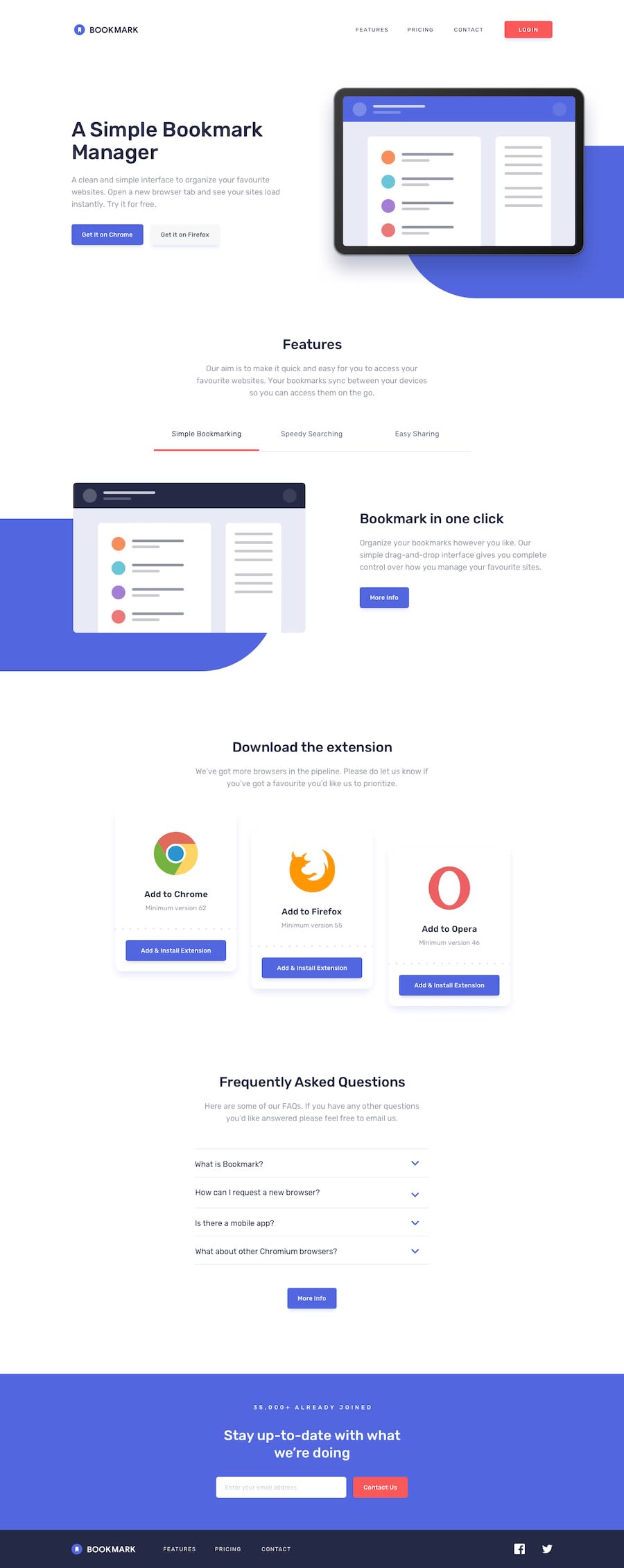
Design comparison
SolutionDesign
Solution retrospective
This challenge was really fun learned a lot from it .Fixed some of the loose ends .Make sure You check it .
Would Love to hear your thoughts
Community feedback
- @ApplePieGiraffePosted over 3 years ago
Greetings, Aman Patil! 👋
Nice job on this challenge! 👏 Your solution looks great and responds well! 👍 And I really like the animation you added to the mobile menu! 😀
A few things I'd like to suggest are,
- Turning the navigation links and the social media icons in the footer of the page into actual links by wrapping them in anchor tags (and giving them a hover state).
- Adding some validation to the email input near the bottom of the page (you can add the
requiredattribute to the input element for some basic browser validation). - Adding a favicon to your site (there's one in the free starter files that you can use).
Keep coding (and happy coding, too)! 😁
Marked as helpful1@Amanpatil-DevPosted over 3 years ago@ApplePieGiraffe thank you so much sir for your valuable feedback I will make changes accordingly
1
Please log in to post a comment
Log in with GitHubJoin our Discord community
Join thousands of Frontend Mentor community members taking the challenges, sharing resources, helping each other, and chatting about all things front-end!
Join our Discord
