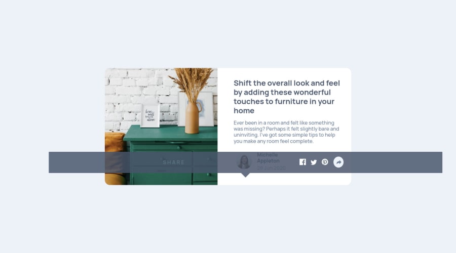
Design comparison
Solution retrospective
I'd love some constructive feedback..
Community feedback
- @FarisPalayiPosted over 3 years ago
Good job on this one👍
One suggestion is that try to set a smaller media query breakpoint for mobile, because, I'm getting the mobile version of the site even though I'm using my laptop to see the solution.
And also, add
cursor: pointerto.share-activeelement to better indicate interactivity, and try using a<button>element instead of a<div>since it's an interactive element used for an action.Have fun coding 👍
Marked as helpful1@SaifN97Posted over 3 years agoHey @FarisPalayi, I agree with all of the points you've stated, I'll surely take them into count on my next projects! Thanks for the great feedback :) Hope you're having fun coding too!
1 - @jmnyaregaPosted over 3 years ago
Good job on the challenge 👏👏
I am a big fan of sass too. They recently made a public notice on the deprecation of the @import rule, they are encouraging developers to use @use instead. import
PS: with the @use rule, your CSS partials will be namespaced.
Marked as helpful1@SaifN97Posted over 3 years agoHey @jmnyarega, Thanks for the heads up, I'll switch to @use rule in my upcoming challenge projects :) I'd love to hear more feedback from you on next challenge solutions hopefully. Cheers🥂
0
Please log in to post a comment
Log in with GitHubJoin our Discord community
Join thousands of Frontend Mentor community members taking the challenges, sharing resources, helping each other, and chatting about all things front-end!
Join our Discord
